Striking a new balance
“The wellness category has become quite saturated and can be overwhelming. We wanted to create a brand that is thoughtful, trustworthy and really breaks through. Our goal is to offer beautiful products that make you feel good, and LG2 helped us do just that.”
Tara Miller
CEO and Founder, Health Hut
Health Hut is a Toronto-based health and wellness retailer who offers a wide range of all-natural, vegan and cruelty-free products. LG2 was approached to update their visual identity, store signage and packaging design for a line of new products. It was clear at the outset that this well-loved brand needed a significant refresh in order to break into the health and wellness category and align with other established players. LG2 was charged with completely rethinking the brand’s visual identity, colours, typography, and design system in order to modernize the brand across all touchpoints, giving it the strength and flexibility to penetrate the category in more effective ways.


Using symmetry and balance to guide the rebrand
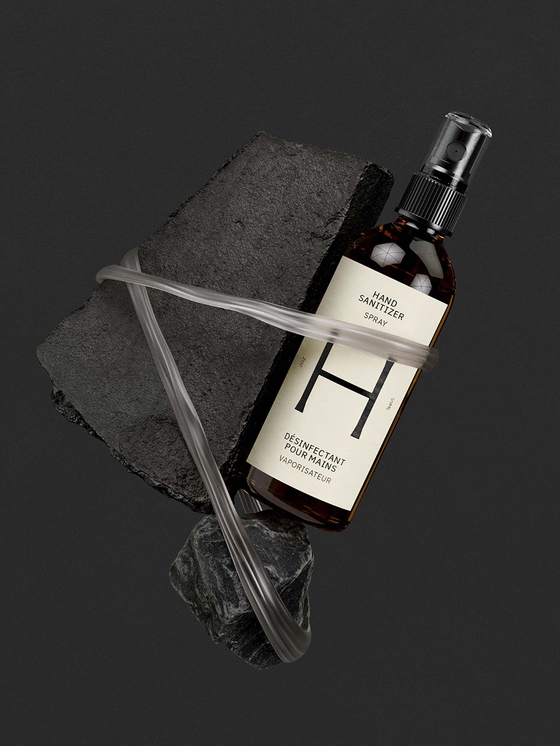
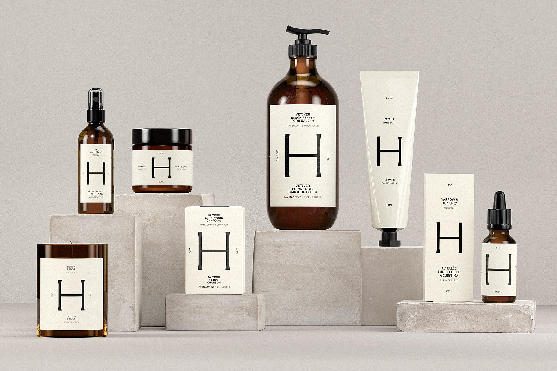
The design process started with one word: balance. Specifically, finding balance within our lifestyles, and living in harmony with nature, the two guiding values of the brand. The design system was founded on this ideology and is anchored by a powerful “H” icon that conveys balance, stability and unity. The wordmark follows suit with its minimal approach and classical detailing.
LG2 also created and produced a packaging design system for a line of Health Hut products, all featuring the “H” icon as a primary brand blocking element. The goal was to make these new products stand-out in an extremely crowded and code-heavy space. The result is an impactful introduction of this new line of products on-shelf, with a brand ready to proudly assert itself in-market.


Rethinking the brand for whole new market
The rebrand, supported by the launch of a new Health Hut product line, was a marked success which resulted in products selling out immediately followed by increased and sustained re-purchasing rates. Traffic in store, online and on social media saw steep increases, and resulted in new creative and lifestyle partnerships.
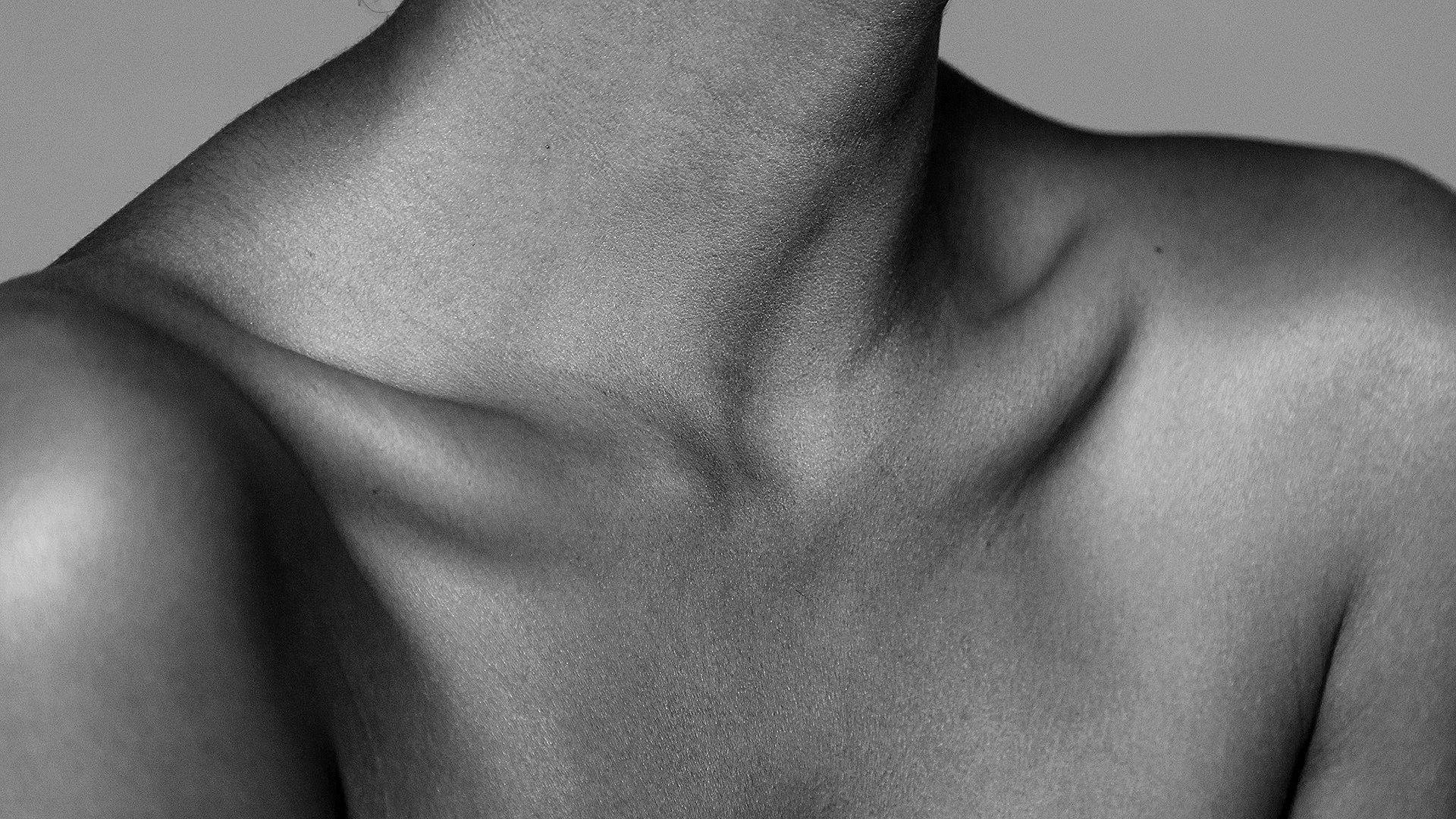
We also established a new approach to photography that proudly features models of all ages, body types, identities and walks of life.


Client
In what was once an old ice-cream hut neglected on the side of the road in Muskoka, Ontario, founder Tara Miller saw an untouched opportunity to bring the benefits of natural products to a new market, transforming the roadside hut into a welcoming space to stock up on natural alternatives to conventional lifestyle, beauty and self-care items.
Health Hut has since grown to two permanent storefronts in Toronto and expanded its collection of natural goods while offering regular events and workshops to educate and connect with their local community.