Bringing digital simplicity to finance
“LG2 has been more than just an agency to us. Its collaborative approach, SEO expertise, technical grasp of data and CMS, and project management support have been essential to making our online brand image more valuable to our clients.”
Hugo Thibault
Vice President, Marketing, FÉRIQUE Fund Management
FÉRIQUE Fund Management is a non-profit organization that reinvest their profits for the benefit of clients. Desiring a digital experience that would embody their mission of promoting the financial autonomy of Quebec’s engineering professionals, the non-profit asked LG2 to redesign the FÉRIQUE website.
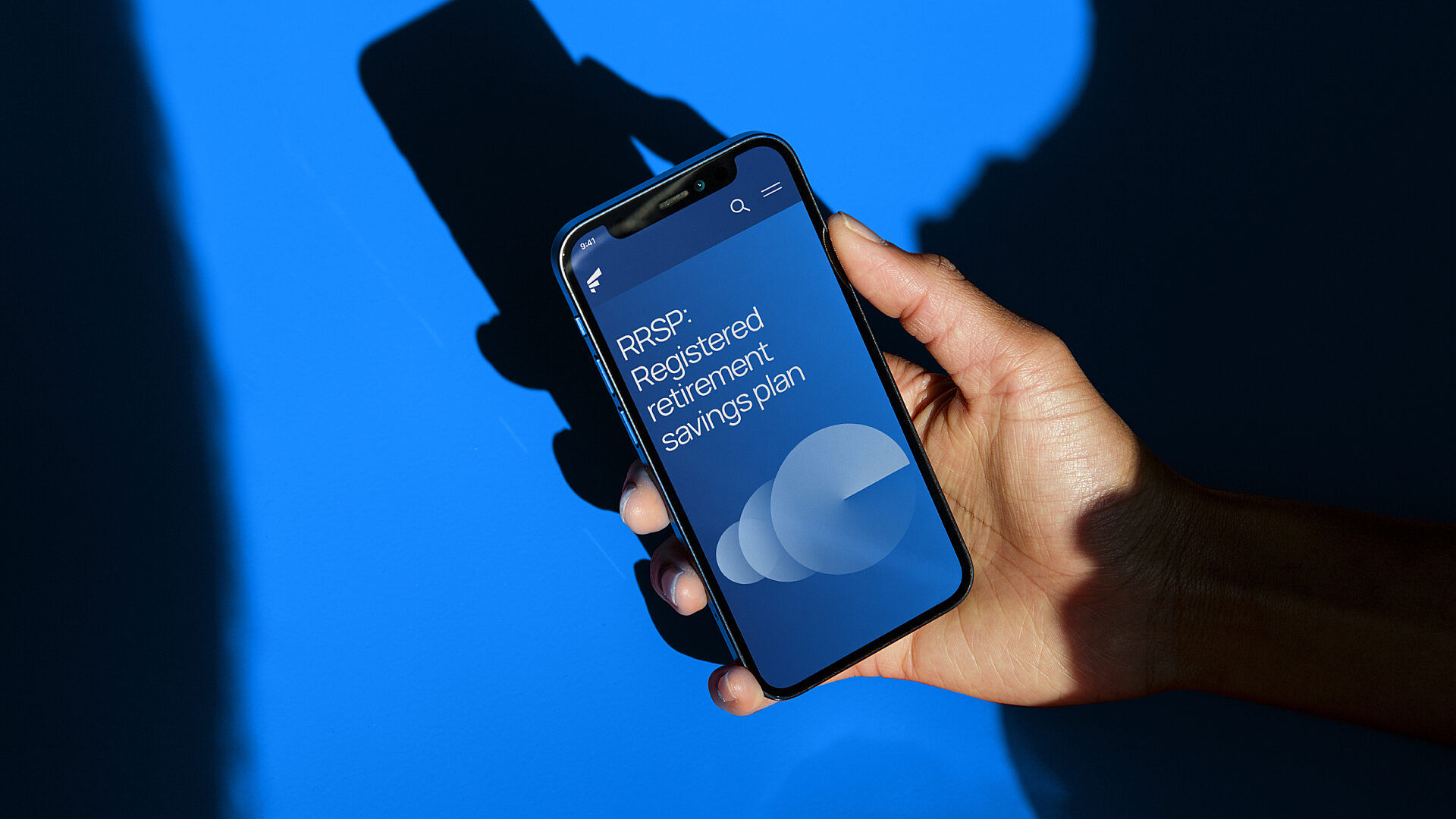
Our mandate was to simplify the user experience for both mobile and desktop and better position the entire FÉRIQUE offer. Led by an experienced project manager, a diverse team of experts in performance, SEO, strategy, interaction design (UX), art direction, interface design (UI), motion design, content, front-end and back-end development, quality control and client services developed the new digital experience for B2C and B2B clients alike.
A robust yet flexible technological solution
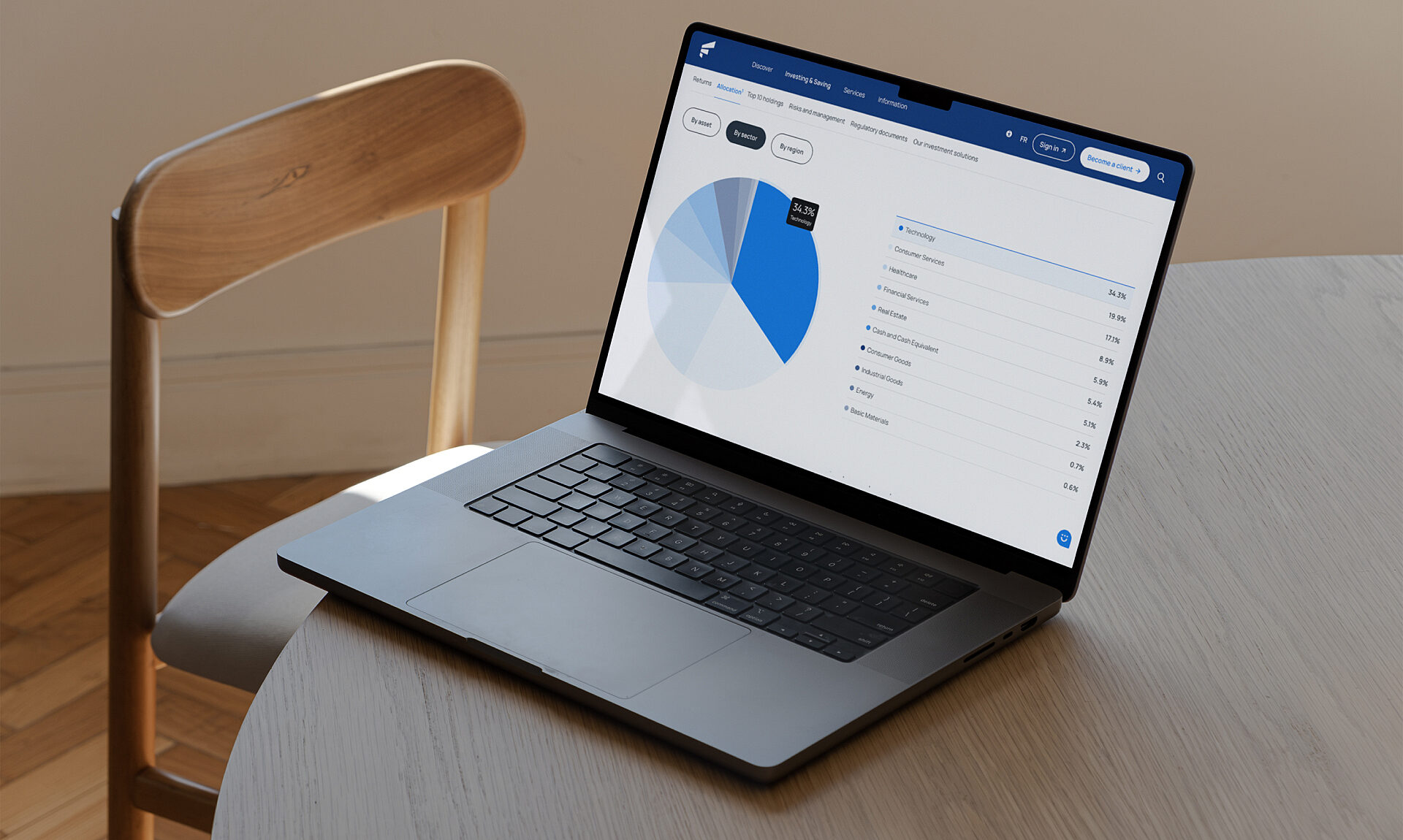
To supply the organization’s clients with all necessary information (i.e., fund breakdowns, prices and returns), our developers faced a number of challenges:
Operating and linking multiple data sources
Managing various update schedules (15 minutes, 24 hours, monthly, quarterly, yearly, etc.)
Connecting the site to real-time data feeds
Developing and applying complex front-end financial calculations
Setting up automated data imports through an FTP with logs, with the option of restarting the import manually if necessary
Our team also had to establish a connection to the “Member Area,” dedicated solely to clients. This section requires protected access for membership applications, access validation and membership renewal.
A secure portal with real-time data
To supply the organization’s clients with all necessary information (i.e., fund breakdowns, prices and returns), our developers faced a number of challenges:
Operating and linking multiple data sources
Managing various update schedules (15 minutes, 24 hours, monthly, quarterly, yearly, etc.)
Connecting the site to real-time data feeds
Developing and applying complex front-end financial calculations
Setting up automated data imports through an FTP with logs, with the option of restarting the import manually if necessary
Our team also had to establish a connection to the “Member Area,” dedicated solely to clients. This section requires protected access for membership applications, access validation and membership renewal.
Putting users’ needs front and centre
Performance and search intent guided the strategic thinking behind the user experience. The site had to meet two distinct yet complementary objectives – sales and support – to target two key audiences: potential clients, who need quick access to info on FÉRIQUE, and current clients, with whom the organization needs to maintain a relationship.
To meet the needs of potential clients, interactivity, scannability and tools such as calculators were used to bring simplicity to what can be a daunting task.
For current clients, we designed a loyalty path to foster autonomy and ongoing education.
Tree testing to better meet client needs
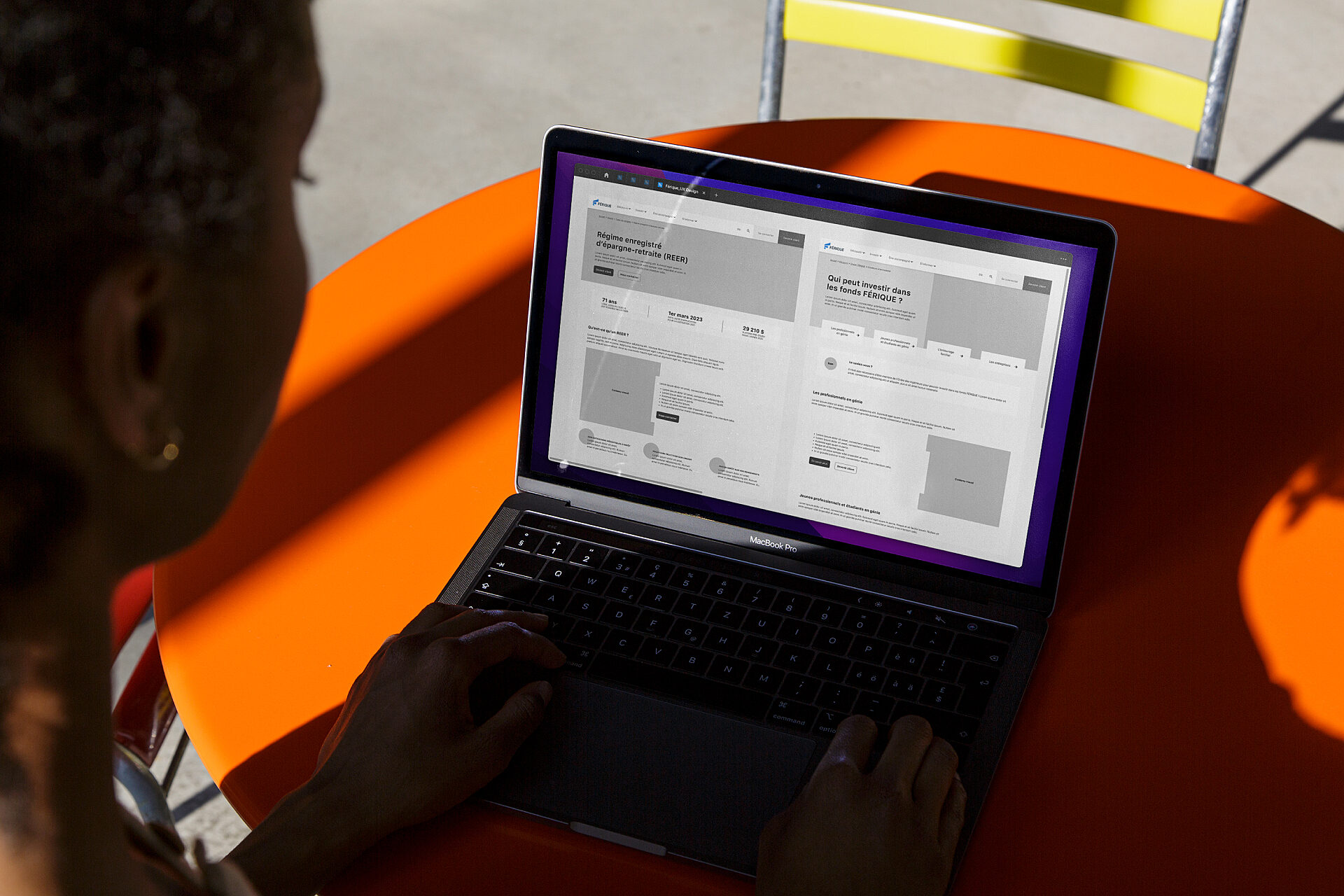
To maximize the site’s usability, our user experience (UX) design team suggested tree testing (card sorting) with FÉRIQUE’s current clients. The test was based on trends identified in the SEO analysis and allowed us to simplify the site’s structure and limit pain points.
Once the tree structure was mapped out, our UX designer created components and templates to build the site’s various pages. This efficient approach gives the client maximum flexibility to enhance and evolve the site’s content for years to come.
A digitally modernized brand image
Inspired by the insight we gained, we modernized FÉRIQUE’s brand image by:
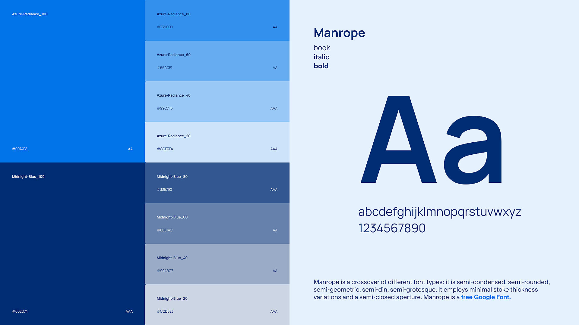
Revising the primary and secondary colour palette to make it harmonious, accessible and compliant with WCAG 2.1 AA standards
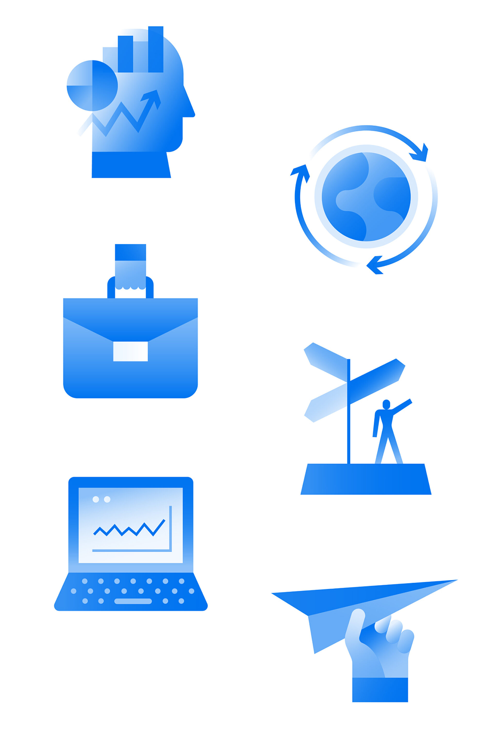
Adding illustrations to make abstract concepts more concrete
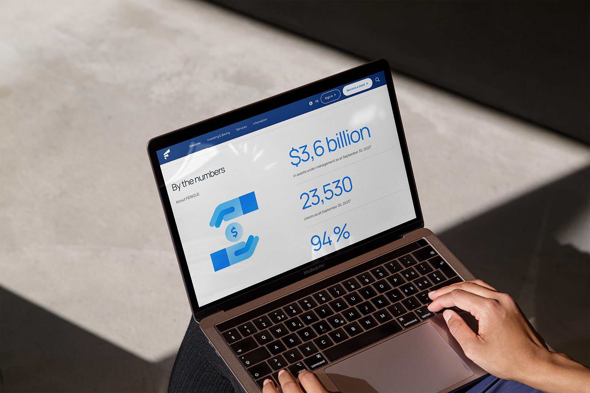
Resetting photo direction and brand tone
Since blue is a strong, signature colour for FÉRIQUE, a monochromatic palette added richness and balance while sustaining the brand’s energy. To make the platform more human, modern and balanced, LG2 collaborated with freelance illustrator Luc Melanson to create graphics for more abstract and general concepts. We provided the client with an icon library and photo direction complementing the new colour palette.
To streamline the typography, a single typeface from Google Fonts now reflects the brand’s tone and, above all, ensures optimum legibility of figures. Lastly, to create greater impact, we played with the angular shapes of the letter F in FÉRIQUE, which can be seen in the transitions and micro-interactions.
Content creation inspiredby search trends
Our digital content creation team came up with SEO-optimized suggestions to ensure the new digital experience could meet the needs of users and maximize SEO potential.
By coupling a fully scannable navigation experience with content tailored to their needs, users can easily assimilate information and skip over any they don’t need. This innovative design serves the brand by creating a sales strategy based on knowledge and education.
An evolving site
Finally, in order to monitor the site’s performance post-launch, we developed a dashboard that offers a global view of key performance indicators. The ongoing identification of optimization points ensures our collaboration with FFM will continue to generate solid value for years to come.

Client
Engineering professionals and students in Quebec can count on FÉRIQUE Funds to help support their financial independence. FÉRIQUE Fund Management sets itself apart from the competition, particularly from large financial institutions, thanks to the quality of its FÉRIQUE Investment Service and its management expense ratios (MERs), which are among the lowest in Canada. A non-profit organization, FÉRIQUE reinvests all its profits for the benefit of its clients.


