Everyone loves a good comeback
“Working on a brand that’s as iconic as Zellers is always a unique challenge. Harmonizing the nostalgia and recognition consumers had with the contemporary challenges brands face in e-commerce takes a willing client and design backed by strategic thought.”
Ryan Crouchman
Partner, Vice-President, Executive Creative Director, Design
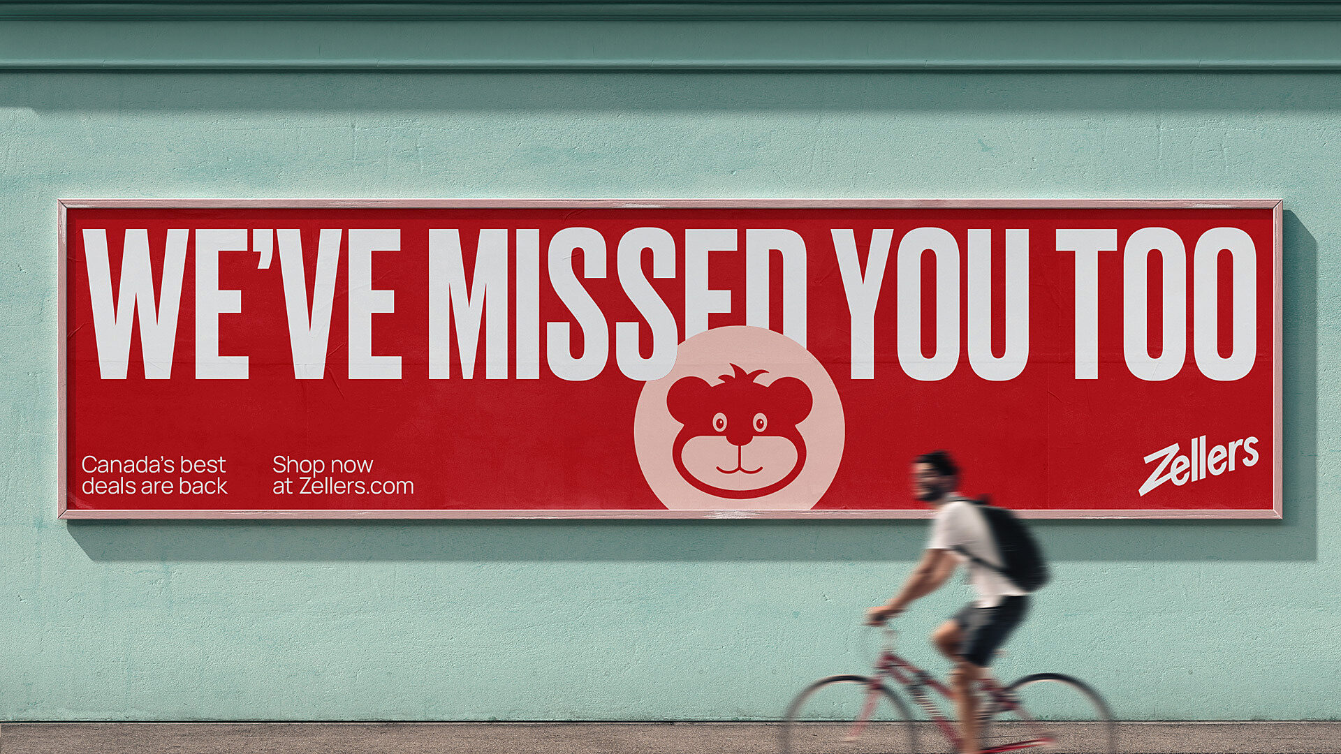
Zellers – Canada’s favourite discount retailer since 1931 – closed its doors in 2013. In 2022, Hudson’s Bay announced it would revive the cherished Canadian brand in order to help meet the needs of a new generation of value-conscious families across the country. Research showed that despite its decade-long absence, the Zellers brand retained high brand awareness and love, even among younger Canadians. Its return was not a question of if, but when.
The new Zellers focuses on high-quality design at a low price by offering a range of products that suit the needs of young families. All of their products are available in-store (as a store-in-store format within existing Hudson’s Bay locations) and online, with a robust e-commerce platform serving customers from coast to coast.
As a trusted creative partner of Hudson’s Bay, LG2 was asked to collaborate on refreshing Zellers’ brand strategy, creating a new visual identity and design system, and providing creative direction and user experience support for its e-commerce platform.

A ready-for-digital logo
Let’s go back in time. When the old Zellers stores closed in 2013, mobile web, e-commerce and social media were not yet firmly established. Today, Zellers needs to compete within a saturated digital marketplace. This required a significant logo overhaul to ensure it displays properly and looks great on any screen, at any size.
We retained the original wordmark’s unique personality and recognition while optimizing the spacing and letterform geometry. Though the original diagonal baseline and italic slant remains the same, the entire logo was completely redrawn. The most notable characteristic – the large Z – was kept intact and can also be used as a standalone icon. The red colour was adjusted to provide more screen contrast and comply with accessibility standards.
A retail platform designed to make you smile
Since the Zellers brand was established long before the internet came to dominate everyday life, the shift from brick-and-mortar to digital required an extensive collaboration with the client. Its physical store locations follow a store-in-a-store model within select Hudson’s Bay stores. Similarly, Zellers’ online platform had to be housed in The Bay’s ecommerce ecosystem.
A seamless shopping experience
This meant the Zellers brand experience needed to co-exist alongside The Bay, which presented a unique CX challenge. In order to create cross-platform efficiencies, LG2 proposed combining shopping carts, user accounts and search functionality, focusing on the platform’s information infrastructure to ensure Zellers’ 10,000+ SKUs would be easy to find upon site launch.
A system that celebrates products at its core
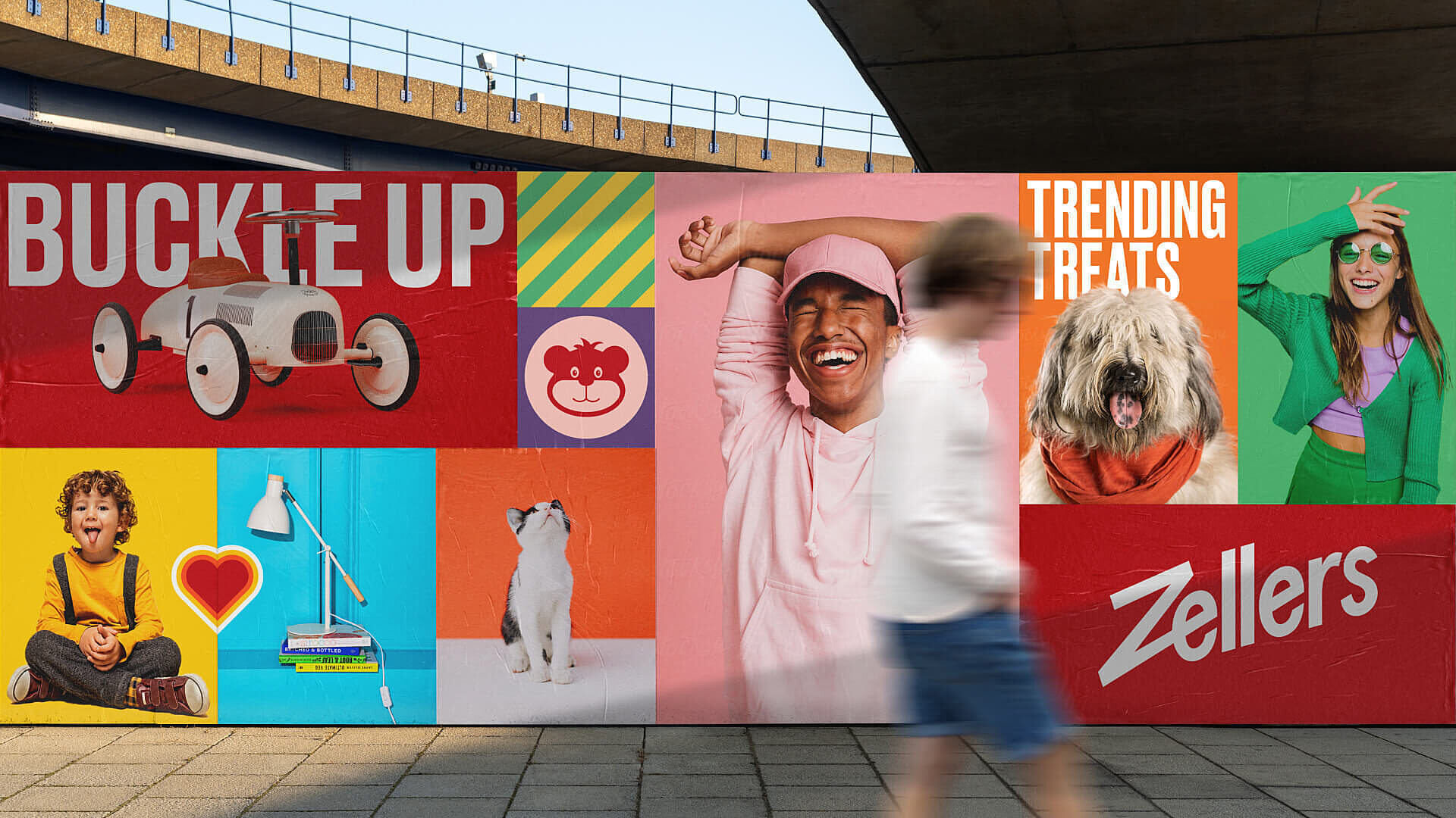
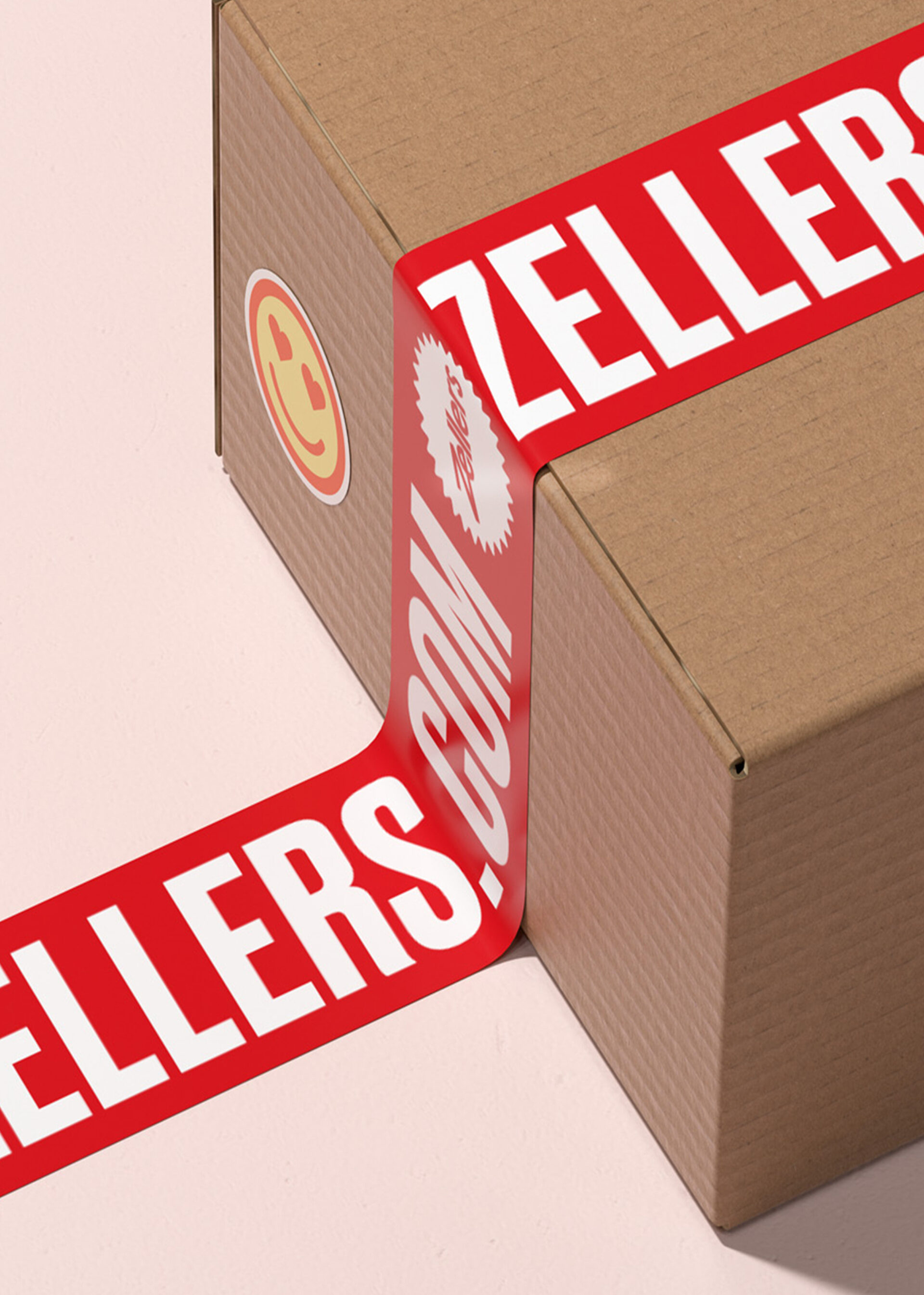
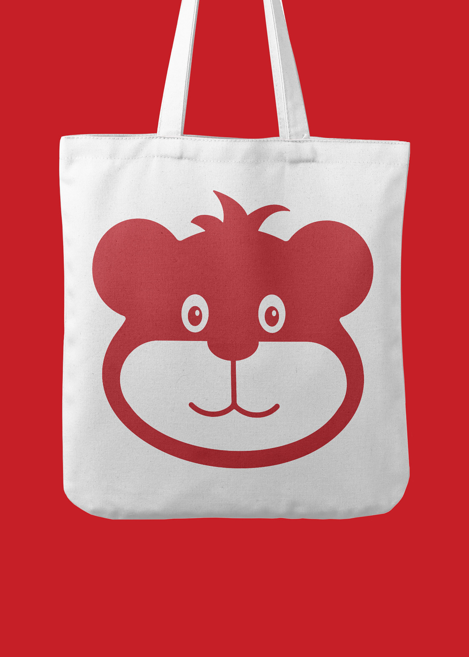
In the end, our goal was to design a flexible retail platform that would capture the hearts of Zellers’ fans. This meant lots of colour, positive energy and good vibes. The system needed to celebrate products at its core and exude a warm, fun and cheeky personality using bright and buzzy patterns, bold typography and playful digital stickers and photography.
A nimble, collaborative approach
The early press release announcing the brand’s relaunch garnered over 2 billion media impressions and over 900 stories, confirming that Canadians were more than eager for a comeback. Working on a tight timeline, LG2 collaborated closely with the client team to develop the strategic brand foundation that would drive the brand design and web development.
LG2 took part in Zellers’ internal work sessions to articulate the brand’s unique selling proposition. Our depth of retail experience and understanding of the Canadian clientele helped us to challenge entrenched assumptions about the “discount shopper” and reframe Zellers’ target as a “value-conscious customer.”
Ultimately, the Zellers brand is built on respect for customers’ time, tastes, values and budgets. LG2 also worked with the client to articulate the three brand pillars guiding the brand experience and design while helping to differentiate Zellers in a crowded marketplace.
Client
One of HBC’s most beloved brands, Zellers holds a special place in Canada’s maple-leaf-shaped heart. And now, with a brand spankin’ new zellers.ca website and 25 locations (to start!) within Hudson’s Bay stores across the country, customers can expect a helpful, playful shopping experience packed full of low prices day in, day out. With a core focus on design and value – and a hint of the nostalgia that Canadians know and love – Zellers is gearing up to become the new go-to, from lifestyle to home and almost everything in between.


