Refreshing a brand with a proud heritage
“Modernizing a brand with this much history comes with a huge responsibility: You need to keep its legacy alive while adapting to new realities. LG2 captured the essence of Ashton perfectly.”
Jean-Christophe Lirette
Co-owner, Ashton
Ashton was the first restaurant chain in the country to specialize in poutine – it’s been serving the iconic dish since 1969. However, as the decades passed, both Ashton’s image and its restaurants remained frozen in time. In 2022, two young entrepreneurs with a vision of expansion acquired the 23 locations of this beloved Quebec brand.
The new owners faced some major challenges: stagnant sales figures, outdated restaurants, an aging clientele and the need to recruit younger workers. It quickly became clear that Ashton’s brand image and experience needed to be revitalized.
Striking the right balance
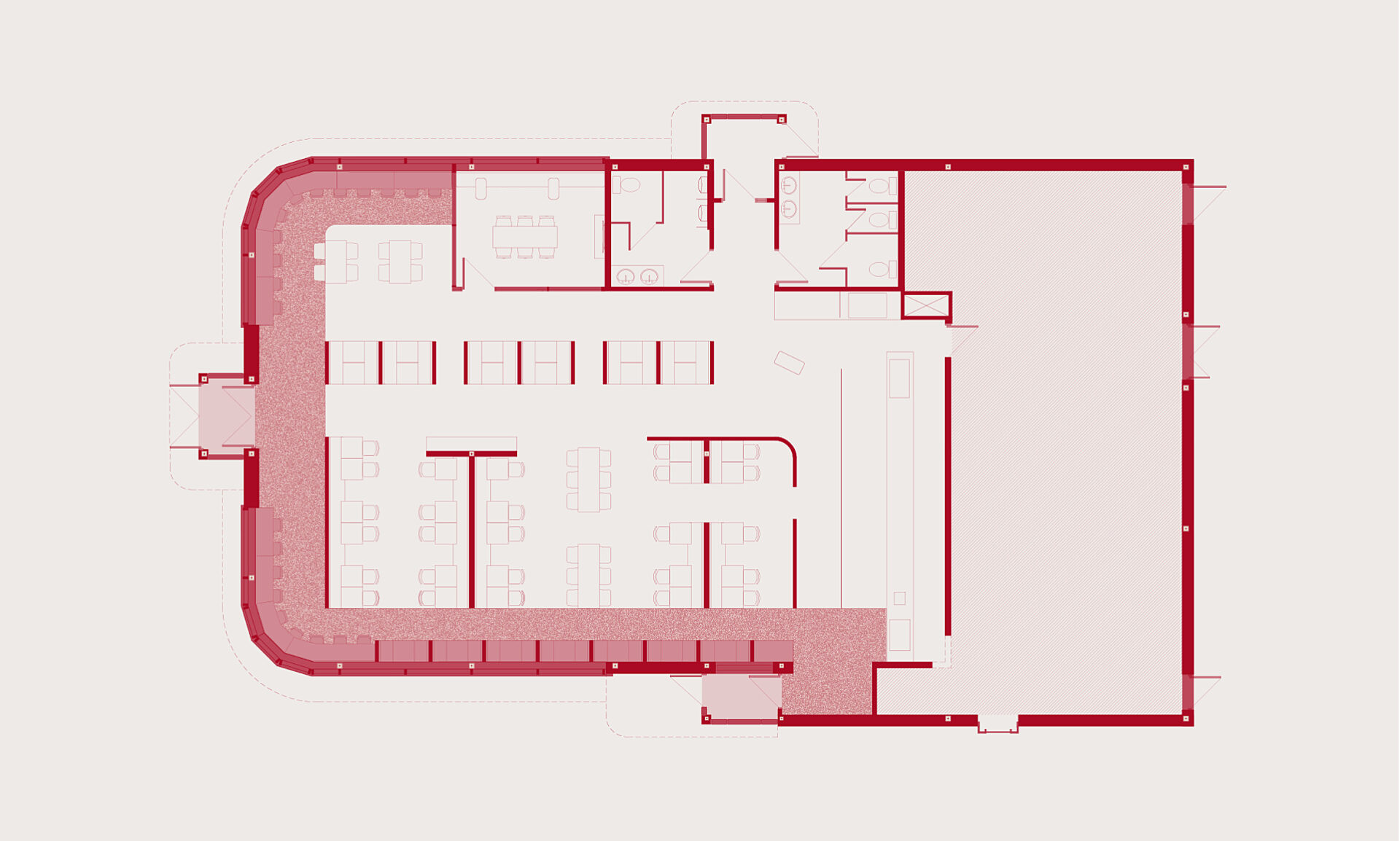
LG2 reimagined Ashton’s entire brand experience at one of its flagship restaurants. Numerous elements were redesigned to simplify the brand as a whole and turn it into an exportable entity.
A new take on nostalgia
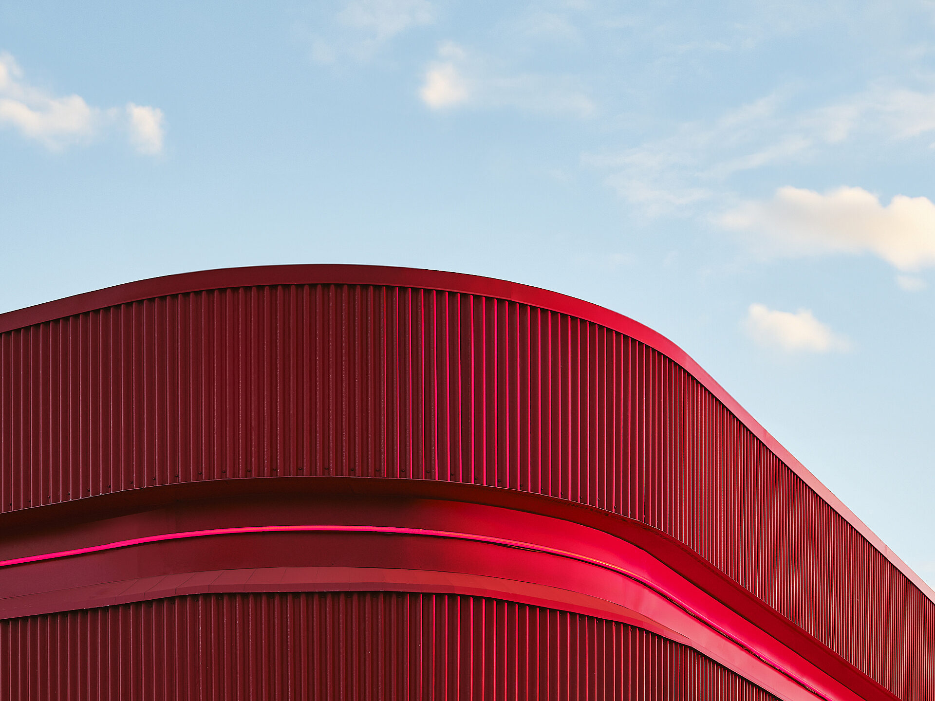
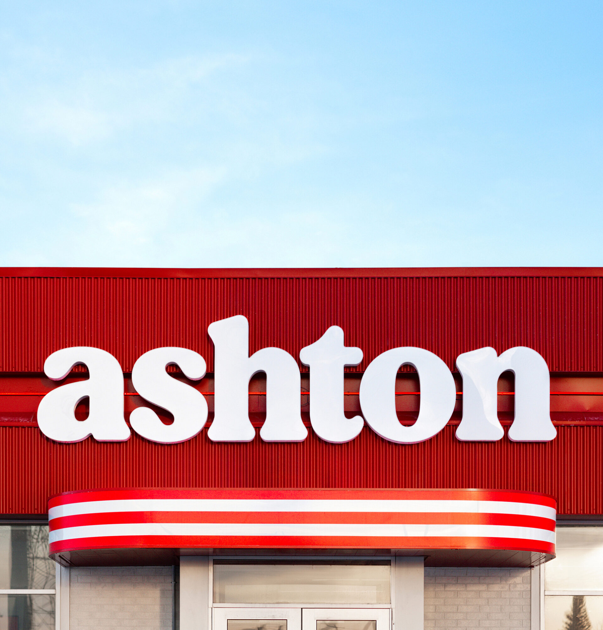
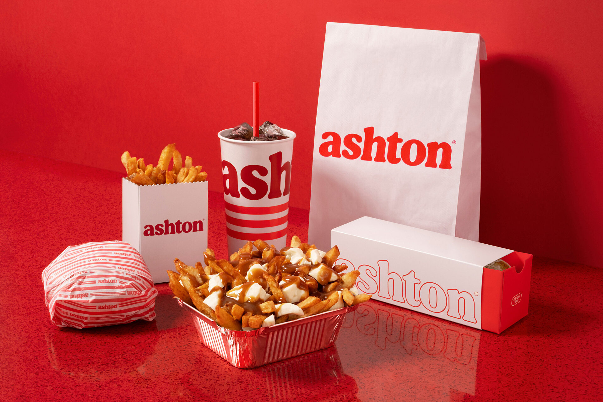
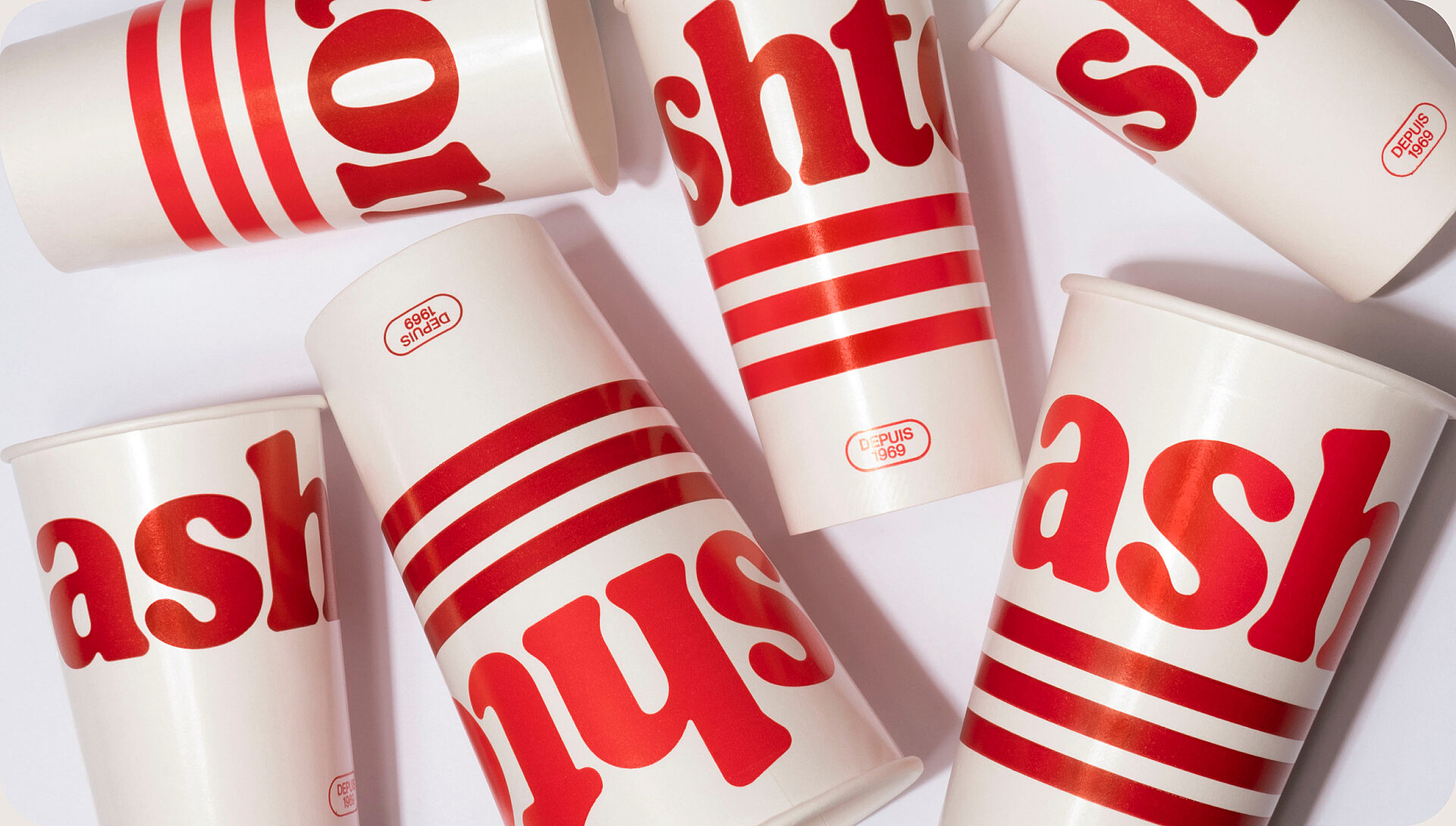
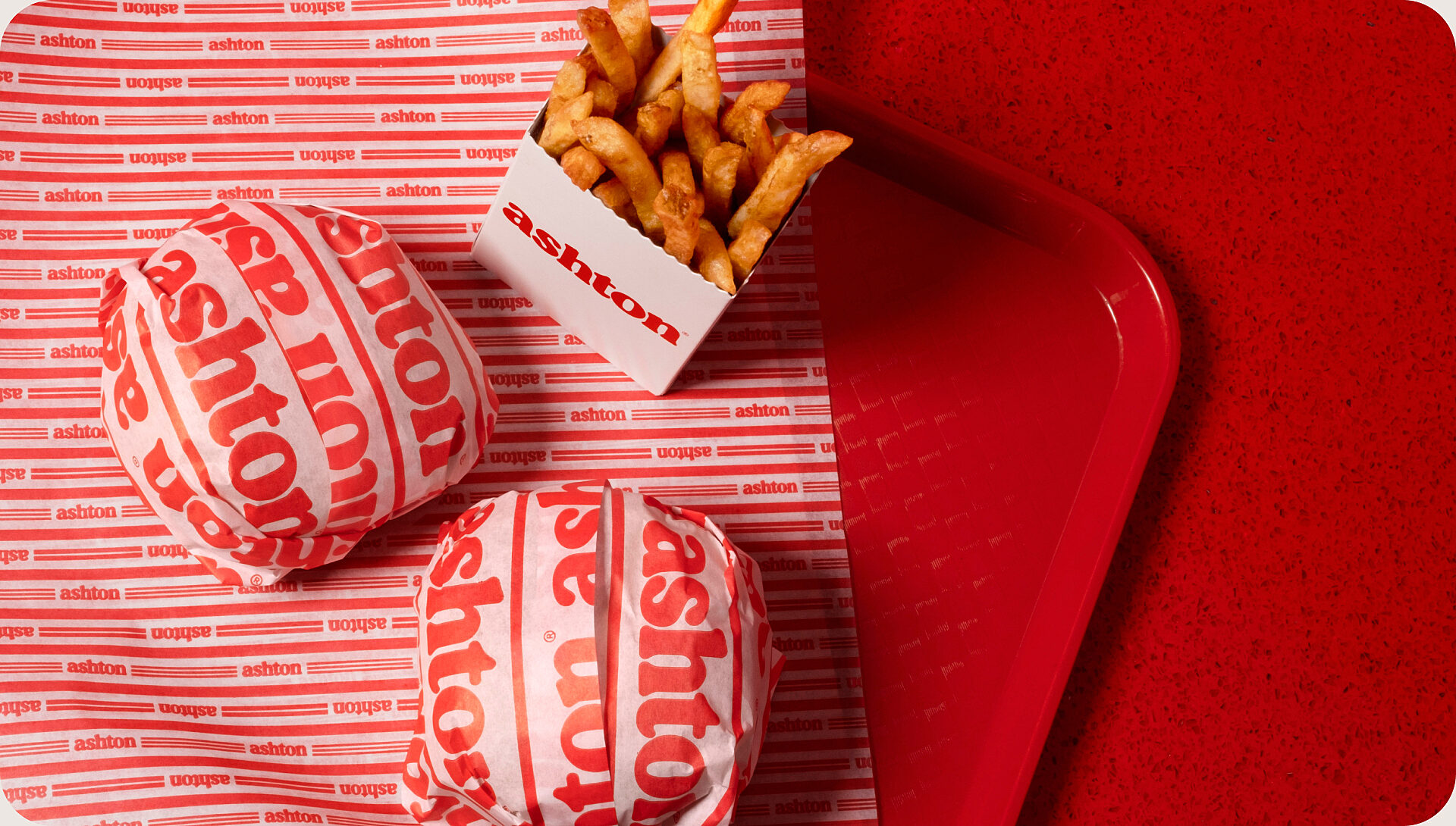
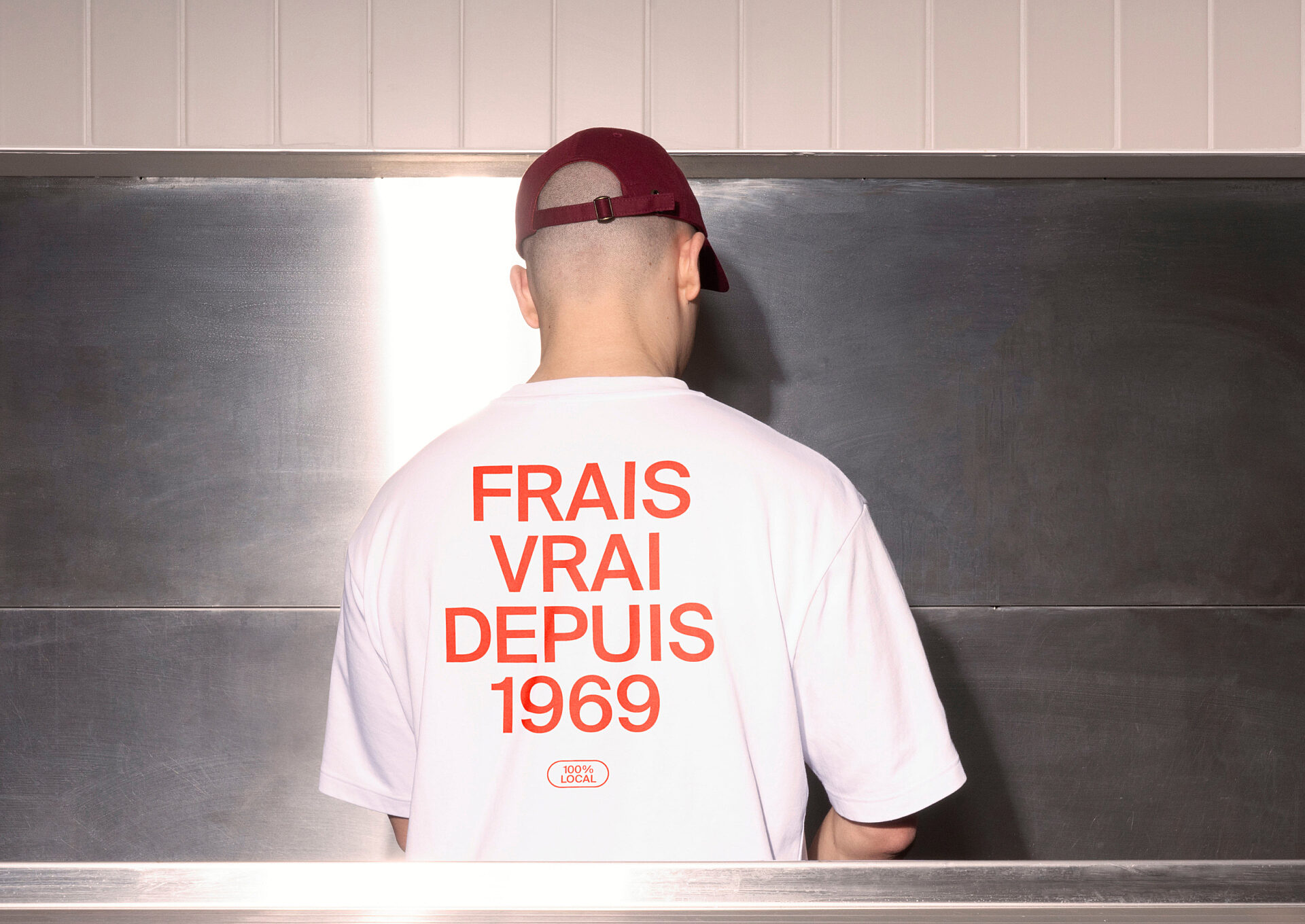
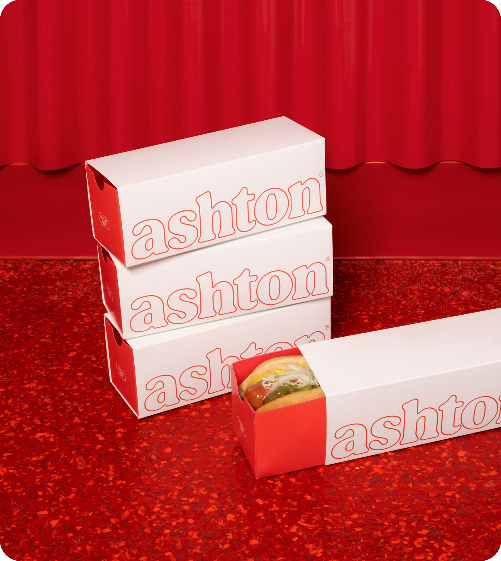
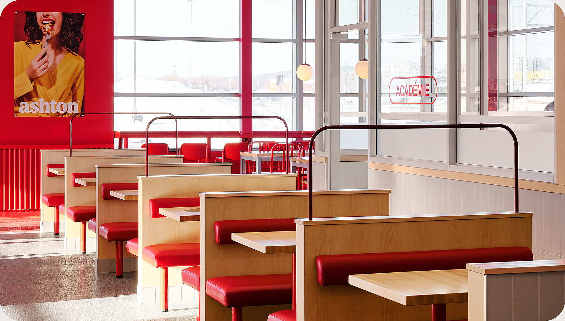
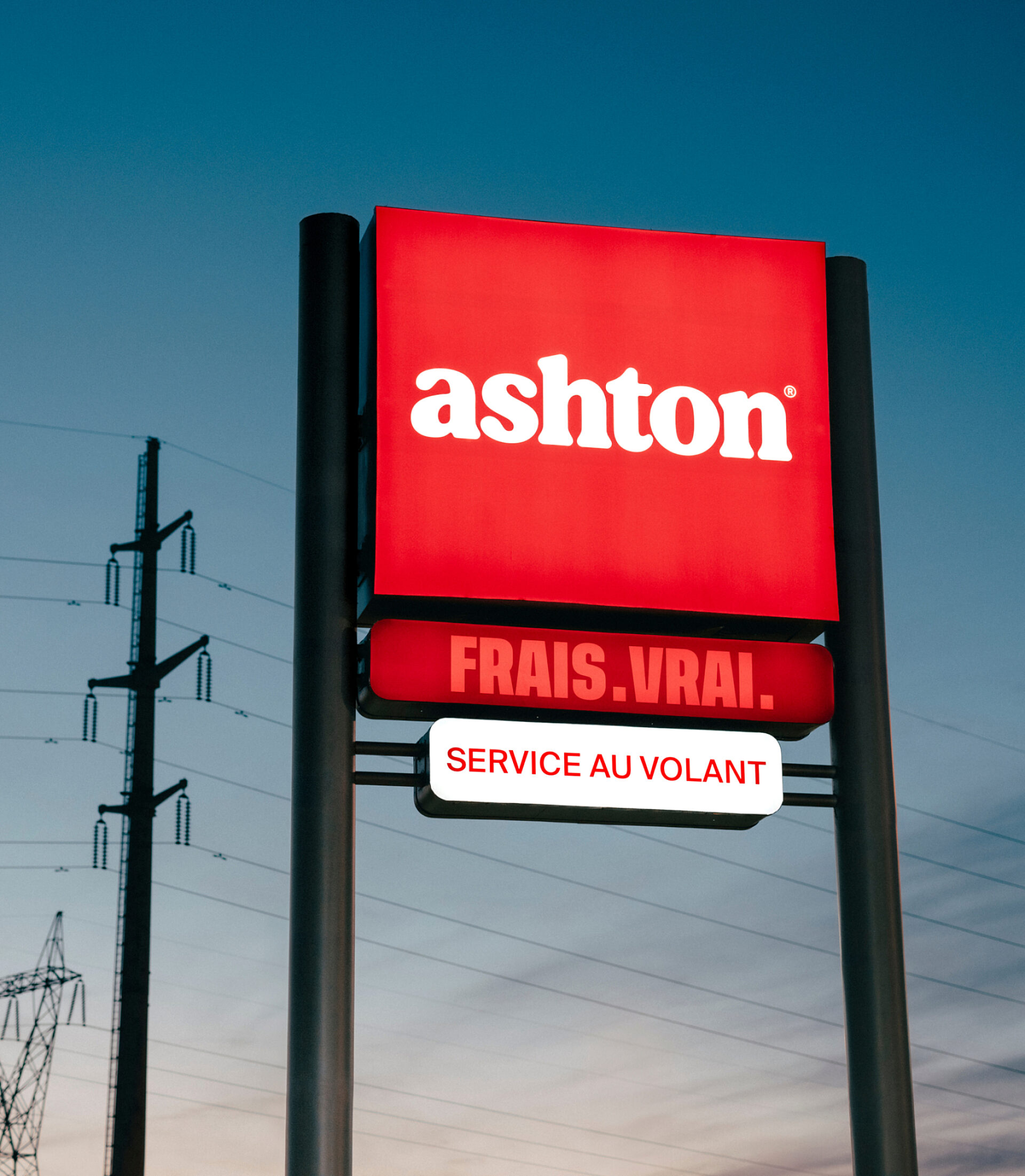
The experience was updated with a perfect blend of modernity and traditions rooted in Ashton’s history. In tribute to snack bar culture, all the classic codes of diners were integrated with a modern twist. A customized typographic signature emphasizing the generous, indulgent nature of Ashton dishes was created, and the chain’s signature red colour was updated. A touch of nostalgia can be felt in the new brand merchandise, which features illustrations reminiscent of one of Ashton’s earliest logos.
The colours are rich, curved edges are prominent and the triple red line – inspired by the chain’s iconic neon lighting – runs through every touchpoint in the graphic system, from the new packaging to the stripes on socks.


A strong local presence
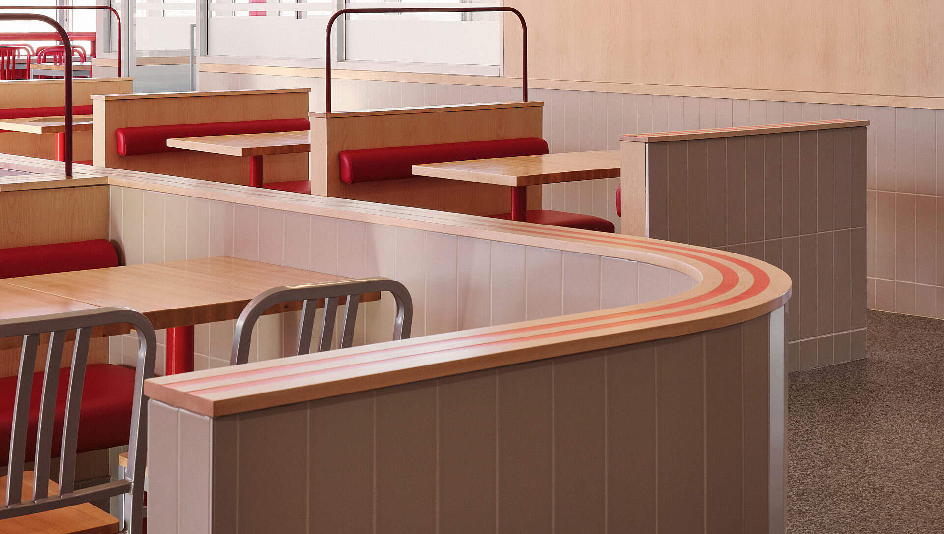
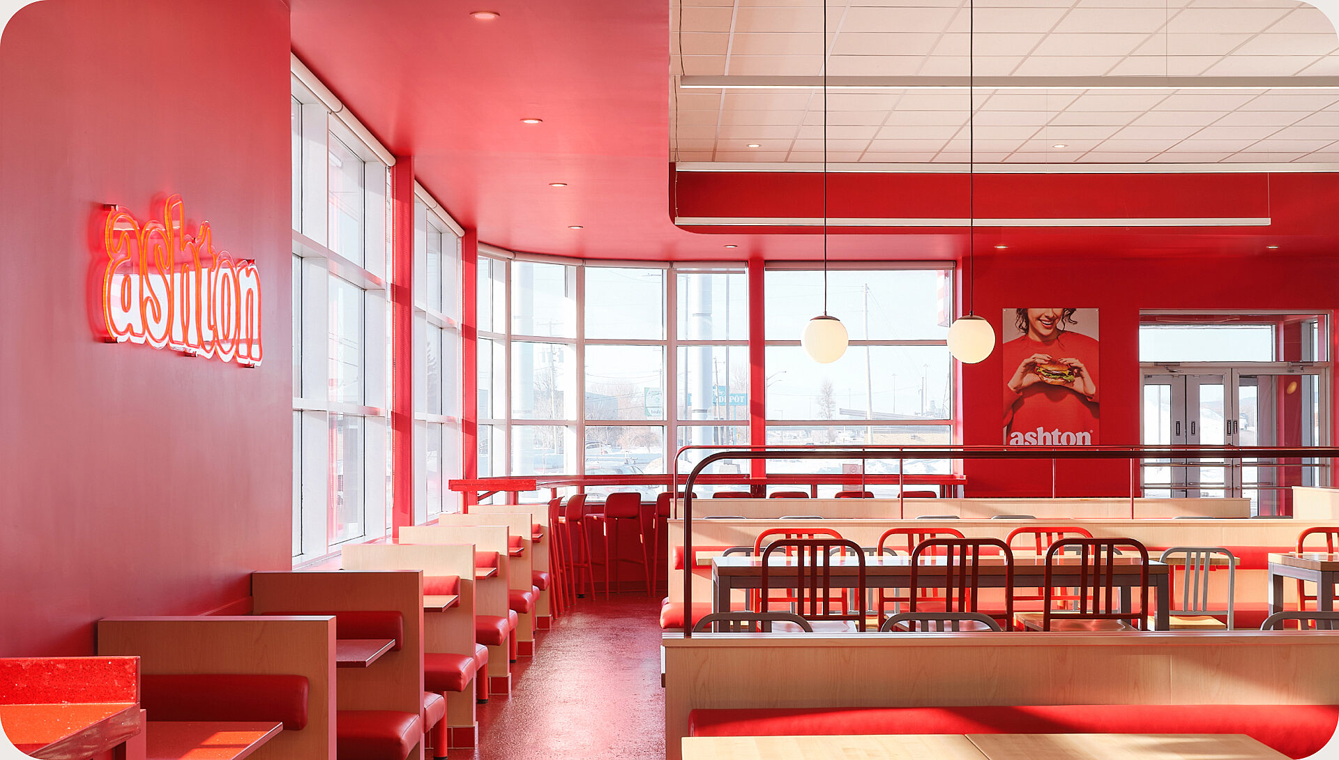
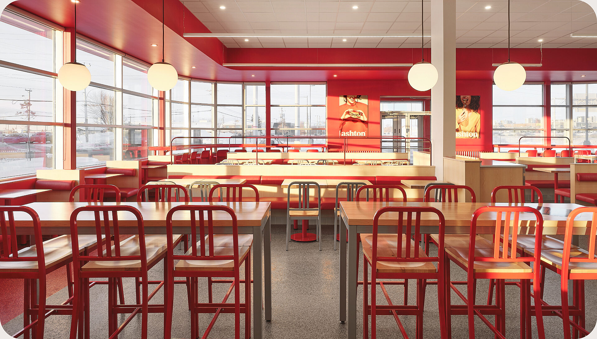
To create an atmosphere as comforting as its food, the design concept was completely overhauled. This transformation can be seen from the outer shell to the interior details: the pervasive curves, neon lighting and red tin roof are all reminiscent of Ashton’s original 1969 food truck.
A monochrome red border runs through the dining room where the famous banquettes are still featured prominently in the centre. This easily reproducible layout will be extended to the chain’s other restaurants over the next few years.

It’s always better in the dining room
A new brand calls for an integrated campaign. Based on the brand’s positioning “Mon moment gourmand” (my gourmand moment), the campaign was infused with a touch of humour and indulgence. It also included OOH advertising, social media content and a partnership with a major junior hockey team in the area.
The secret is in the sauce
The numbers speak for themselves. Within 30 days of launch:
35% increase in traffic at the first renovated location
34% increase in sales at the first renovated location
40% increase in visits to the Ashton website
Ashton found the perfect recipe for securing the loyalty of diehard fans while attracting new foodies on the hunt for a retro yet contemporary experience.
Client
Since 1969, Ashton has been a pioneer of fast food in Quebec. With a history rich in tradition and quality, the chain has become a staple for Quebecers. In 2022, owners Émily Adam and Jean-Christophe Lirette took over the reins from Ashton Leblond, injecting new energy into the well-established chain. In a warm and friendly setting, customers can savour every bite of Ashton’s classic dishes while creating treasured memories. With its diverse menu, Ashton remains the number one choice for poutine lovers, offering some of the best poutine in Quebec.