A historic change for Cordon Bleu
“This rebranding project boldly reimagined our visual identity by blending timeless elegance with subtle innovation. LG2’s understanding of our needs and expectations was at the heart of our work process, ensuring the success of this evolution.”
Ariane Chrétien-Deland
Brand Director, Cordon Bleu

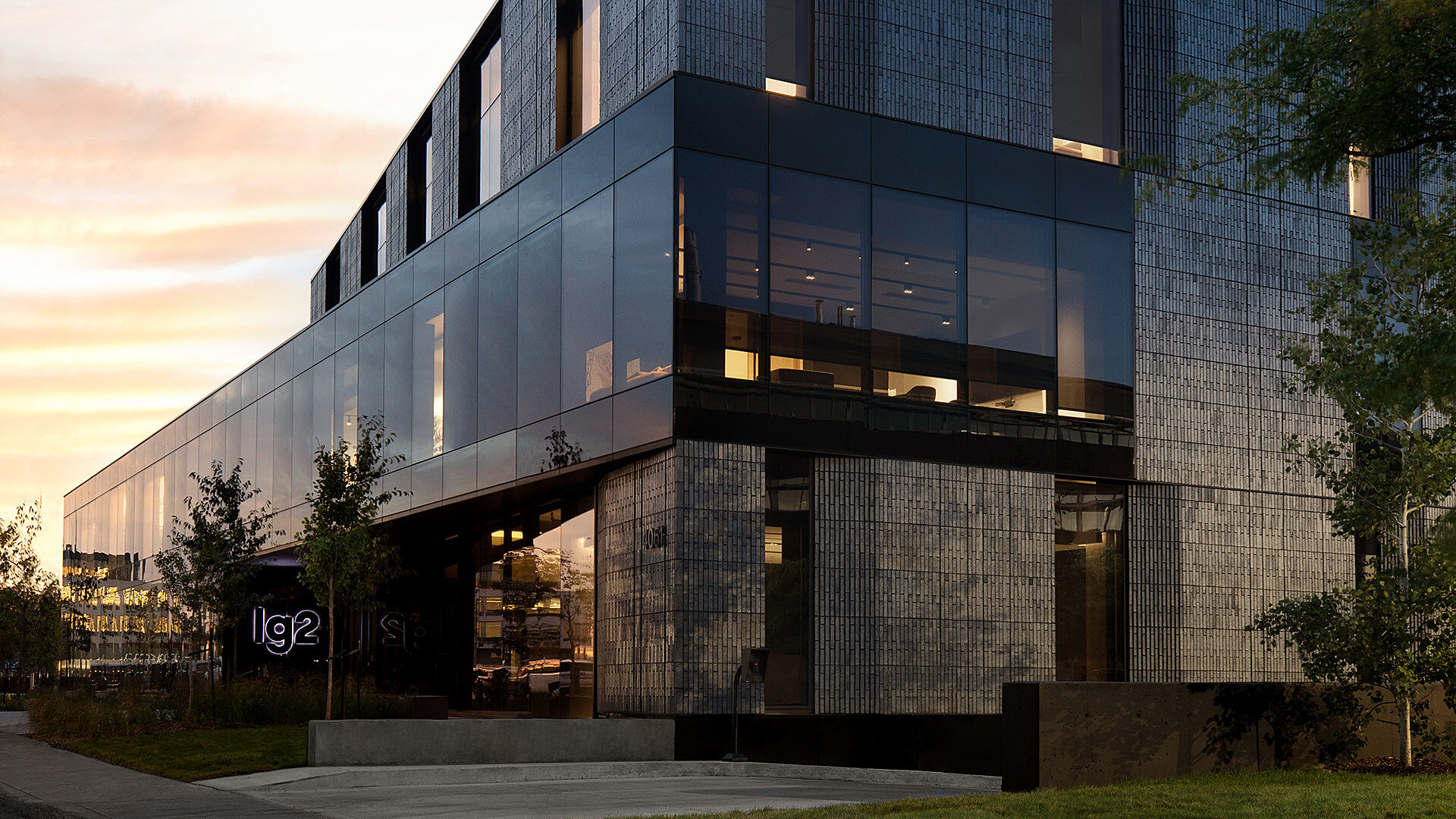
Client
Cordon Bleu
Services
Strategy
Packaging
Branding and Design
Content
Advertising
Production
Shopper Marketing
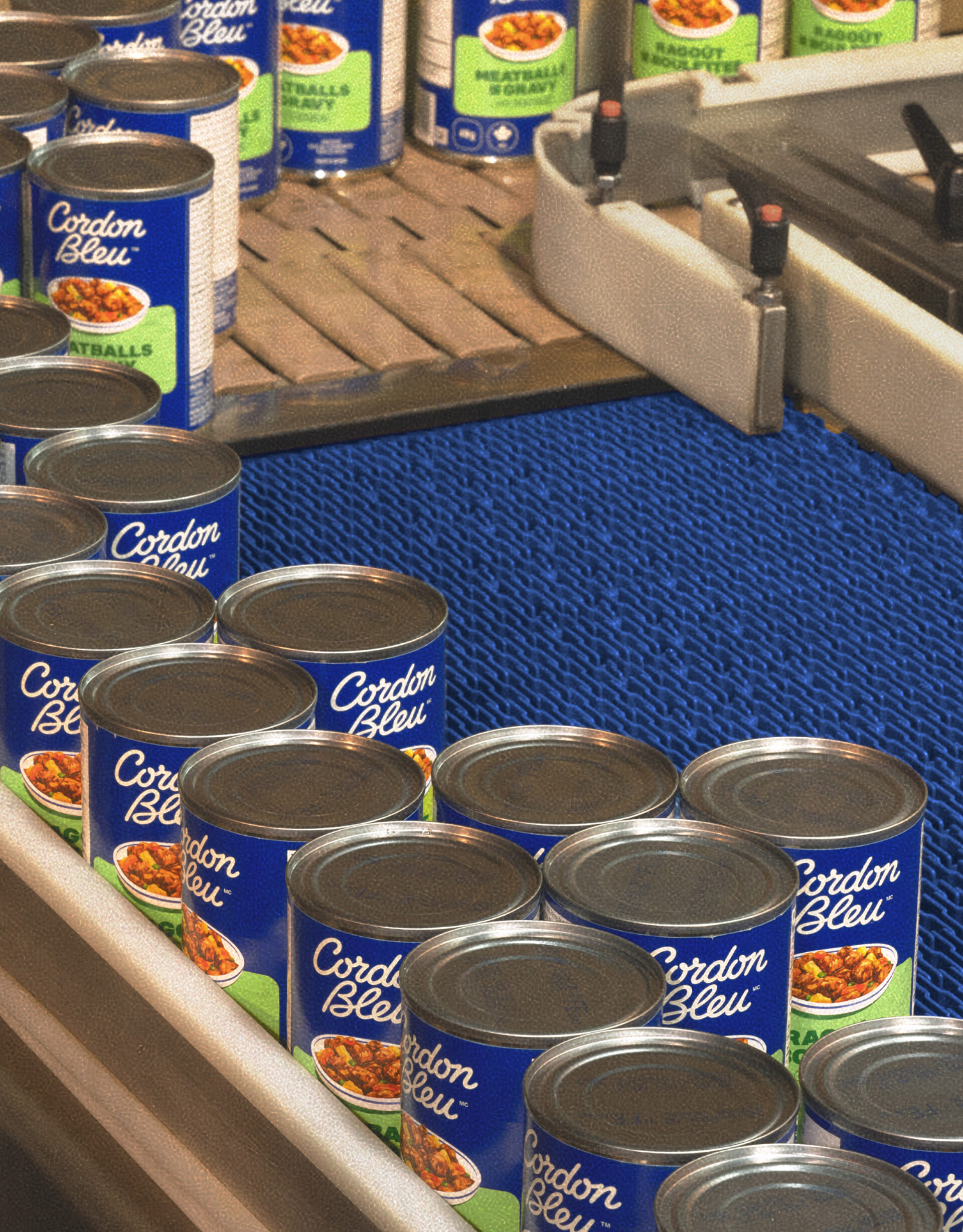
Since 1933, Cordon Bleu has been more than just a source of delicious dishes – it has become a culinary icon in Quebec households.
But over 90 years later, the well-known brand needed a refresh to attract the attention of new consumers and regain its place in kitchens where it was once known and loved. To restore its status, LG2 worked with the brand to reclaim its iconic colour – blue – and refresh its image to help it stand out on grocery store shelves.
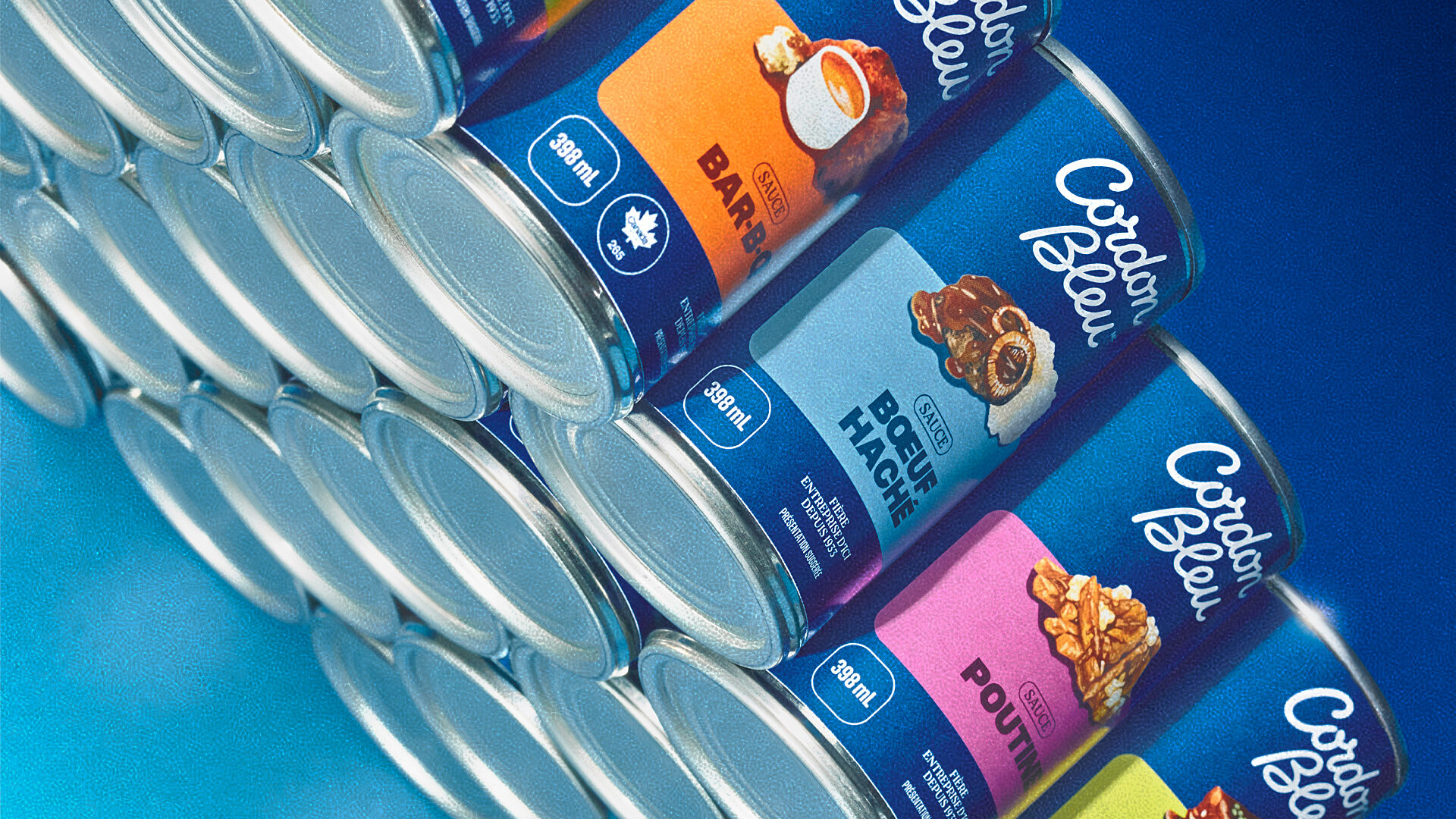
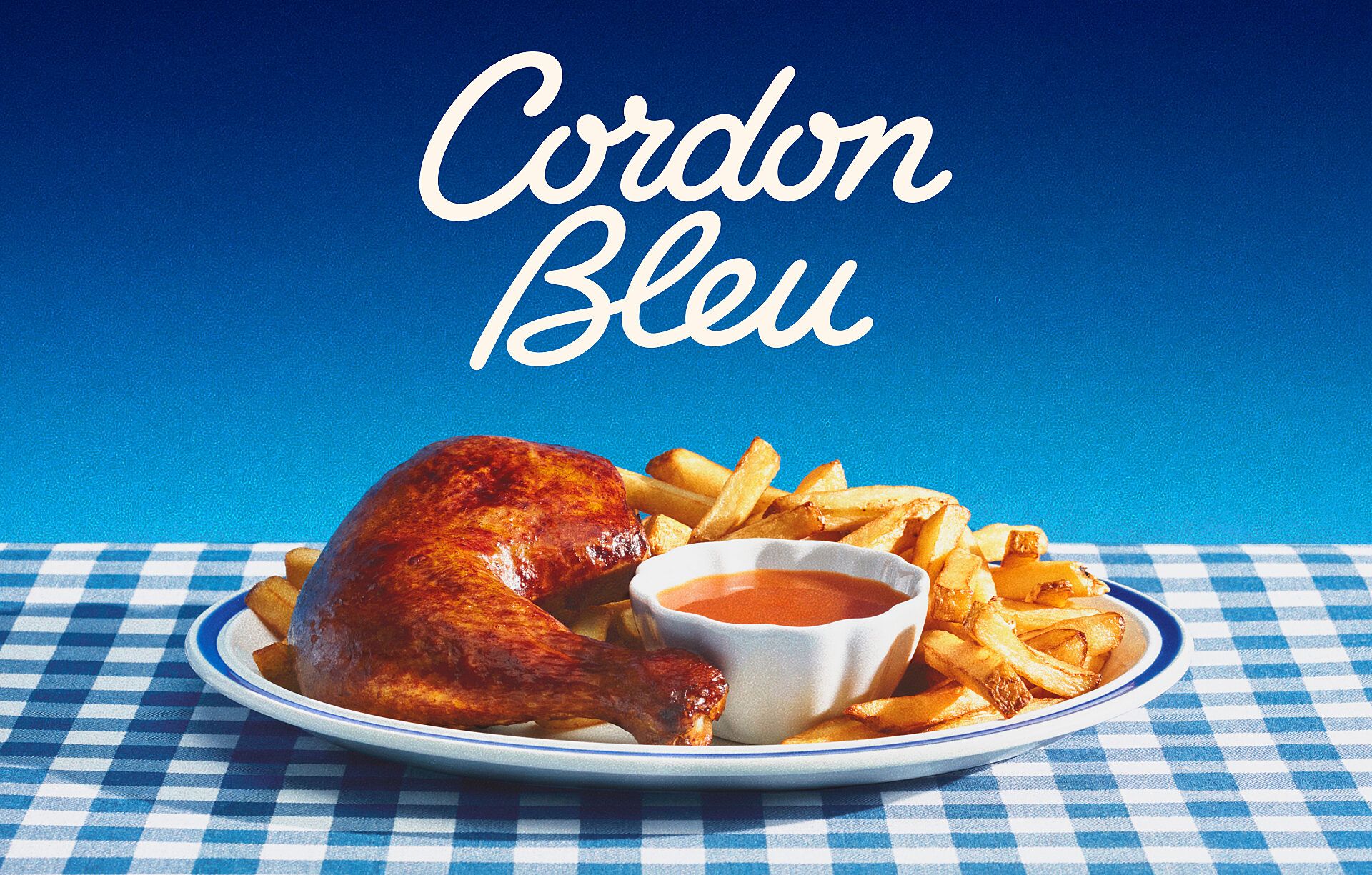
True blue for today’s tastes
Aware of Quebecers’ attachment to the brand’s well-known logo, we redesigned and refined its traditional blue to make it sharper and more eye-catching. The new deeper blue retains Cordon Bleu’s vintage feel and brand attribution while appealing to today’s shoppers.
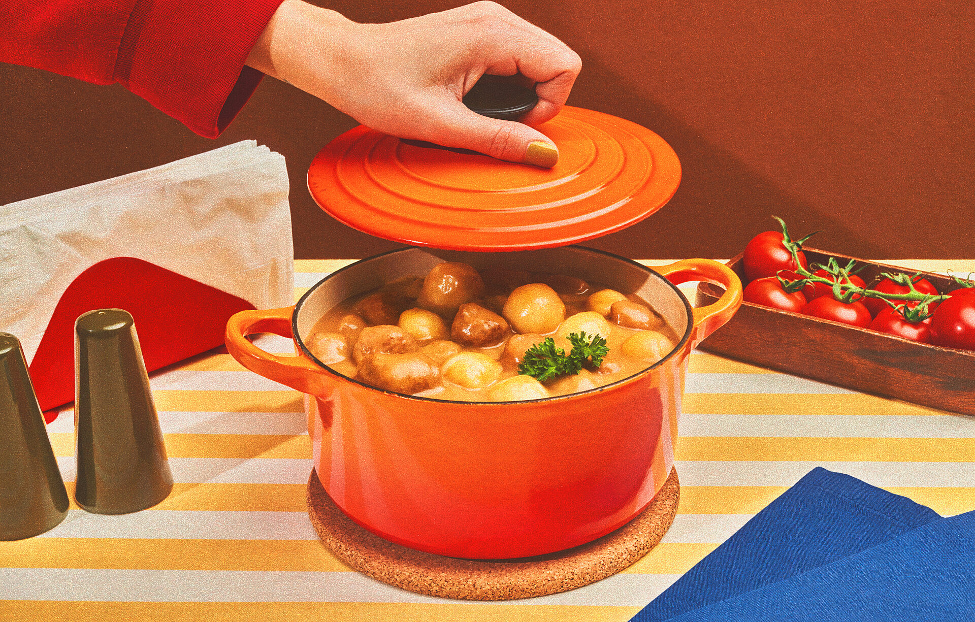
To enhance its visual identity, each element was made fresh and modern. Muted, grainy photos lend a contemporary touch with a nod to the brand’s rich history.

Nostalgia on the shelves
The updated packaging features gouache illustrations by a local artist, reminiscent of recipe books of the 1960s and 1970s.
These custom-designed illustrations in the brand’s bold new colour make the packaging easier to navigate in grocery stores, and the enhanced visual identity captures attention on shelves to reconnect with consumers.


An everyday partner
Cordon Bleu, already a classic, reinforced its top position with three 15-second animated spots produced by LG2. Trop de choses sur le feu (Too much on the stove) is a campaign in line with the brand’s image makeover, immersing viewers in the new visual identity. The skits, which many people can easily identify with, conclude with the new tagline: Facile. Rapide. Savoureux. (Easy. Fast. Tasty).

A hearty homecoming
At a time when consumers are looking for comfort, ease of preparation and affordability more than ever, Cordon Bleu is a timely, satisfying and on-trend solution.
Over the decades, Cordon Bleu has continued to be a faithful partner to Quebec families, combining tradition and innovation with boldness and passion.
Client
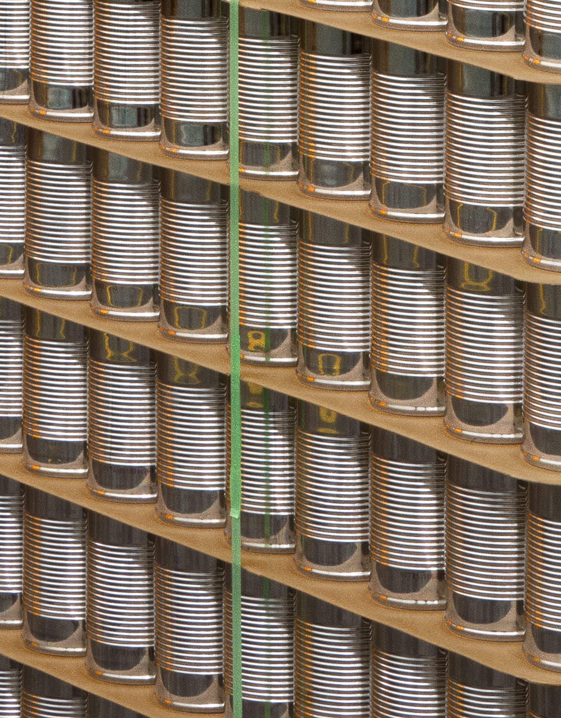
For over 90 years, Cordon Bleu has been keeping North Americans happy by developing and marketing affordable comfort food lines under its Clark, Cordon Bleu, Paris Pâté and Esta brands. The company is also renowned for its co-manufacturing services for major multinational food companies and the production of private labels for some of the world’s largest and most demanding food retailers. A leader in the marketing of prepared beans, sauces, meat spreads, canned soups and stews, Cordon Bleu also stands out for its unique organizational culture, focused on authenticity, pride, well-being and fun! To find out more about the passion that drives us, and to take part in our dynamic growth, visit www.cordonbleu.ca.