Web inclusivity means web accessibility
Web inclusivity means web accessibility
By
Anne-Marie Lavoie, Associate Creative Director, Digital Experience
Irene Sierraalta, Team Lead and Developer, Member of the Accessibility Committee at LG2
When we think about inclusivity, we often associate it with diversity, equity and inclusion in the workplace, accessibility in public spaces or the use of inclusive language. But how does it apply to the digital world? With technology’s omnipresence in our daily lives, it’s essential that a brand’s digital touchpoints offer an inclusive experience too.
Web accessibility has a simple objective: To make sure everyone can use a website or online tool regardless of any mental or physical disability they may have. To achieve this, a number of emerging technologies and turnkey solutions based on artificial intelligence are now available – which, on paper, seem to tick all the accessibility boxes.
Since accessibility touches a wide spectrum of the population, including people with temporary or permanent physical or neurological disabilities as well as those with learning disabilities, we need to move towards fully inclusive digital experiences.
We often see digital products that appear to be intuitive and relevant at first glance. They offer the kind of experience that gets people talking and makes a brand stand out. Unfortunately, many of them don’t meet global web accessibility standards. So how can we best serve the needs of all our target audiences?

Surface solution or step in the right direction?
According to the World Health Organization, one in six people live with a disability. This figure is rising and doesn’t include learning disabilities. In other words, a significant portion of your target audience, whoever they may be, need adaptive measures to enjoy an optimal digital experience.
This means that, at a minimum, your brand needs to comply with version 2.0 of the Web Content Accessibility Guidelines (WCAG) – the most recent version being 2.2 – defined by the World Wide Web Consortium (W3C). These standards, which have been adopted by Canada, are specifically aimed at people living with one or more hearing, cognitive, neurological, visual, speech or learning disabilities.
Many of the solutions on the market, such as accessibility overlays, offer options for adjusting contrast and text size, stopping animations on command and reading sites using a modal, i.e., an element that’s displayed over a web page and prevents interaction with it. These overlays, however, are not without criticism, and don’t guarantee compliance with WCAG 2.0 standards – at least, not yet.
Still, overlay tools are a step in the right direction for any brand wishing to embrace accessible web design. The problem is that turnkey solutions and accessibility panels often conflict with assistive tools that users are already working with, whether its speech-to-text software or screen readers, creating an even more complex experience for some.
We need to make sure we’re not “accesswashing,” which means presenting a web experience as inclusive, when in fact it’s not. The key to avoiding this trap? Include accessibility at every stage of the design process to make it a deliberate and meaningful part of the project.
Accommodations for all
So what does this look like in concrete terms? We recently had the privilege of collaborating with Collège Nordique to develop a plug-in specifically designed for its students’ diverse realities. Located in the Northwest Territories, this Francophone institution serves a unique community including: 11 official languages, a large Indigenous population and newcomers from around the world. Quite a challenge!
To support the school’s mission of promoting the vitality of Francophone communities in Northern Canada, we designed the new website’s user experience to be both accessible and inclusive.
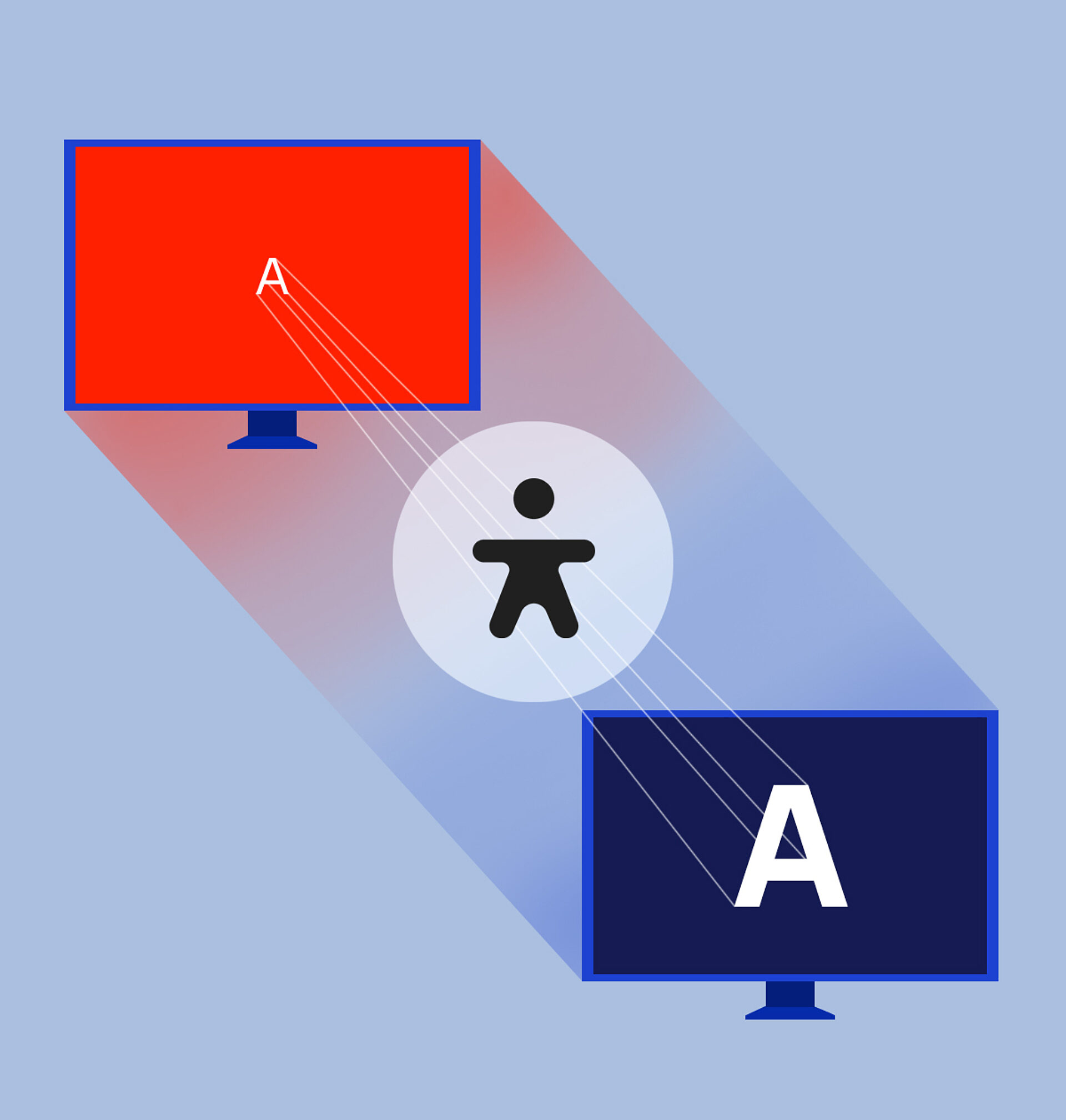
We created a customized tool for a comprehensive experience offering more reading options than the usual AA accessibility standards. This made it possible to tailor the experience to individual needs using:
Text size adjustment (100%, 150% and 200%)
Visual style adjustment (original colours, high contrast or reverse high contrast)
Font adjustment (original or OpenDyslexic)
Letter spacing adjustment (original, 5% or 12% increase)
Text spacing adjustment (original, 10% or 20% increase)
Possibility of deactivating all animations
This new feature is more than just a plug-in, since it was conceived from the outset in terms of design and programming. As a result, it won’t conflict with users’ existing tools or assistive technologies.
“Accessibility is never black and white. It’s so vast that we have to focus on specific use cases or specific projects.”
Being good a11ies
At the end of the day, there’s no one-size-fits-all solution for making a site easily accessible. We have to take a case-by-case approach. That’s why LG2 set up an accessibility committee that brings together individuals with a wide range of digital expertise. Given the rate at which the digital world is constantly evolving, along with our realities, the committee makes sure it’s at the forefront of advances in the field. Because a point of view that was highly valid a year ago may not even be relevant today – and that’s just as well. It means we’re progressing and constantly improving the user experience to benefit everyone.
Our goal is to maintain the same level of accessibility – and quality – across all our digital products. We have to remind ourselves every day that we’re not necessarily our target audience, but we can always be part of the solution. By taking people with disabilities into account during every stage of the decision-making process, from the discovery phase through the evolution of a digital product, we can ensure inclusivity through web accessibility.
Web accessibility helps companies put their money where their mouth is when it comes to diversity, equity and inclusion. With the right approach, UX designers, UI designers and web developers can become your strongest resources for bringing inclusivity to life – in a tangible way – online. Inclusivity can be as simple as changing the text on a button to make it more clear. The devil is in the details, and so is inclusivity.


