The nutritional symbol: Understanding it and incorporating it into your packaging
The nutritional symbol: Understanding it and incorporating it into your packaging
This article originally appeared in L’actualité ALIMENTAIRE on September 24, 2024.
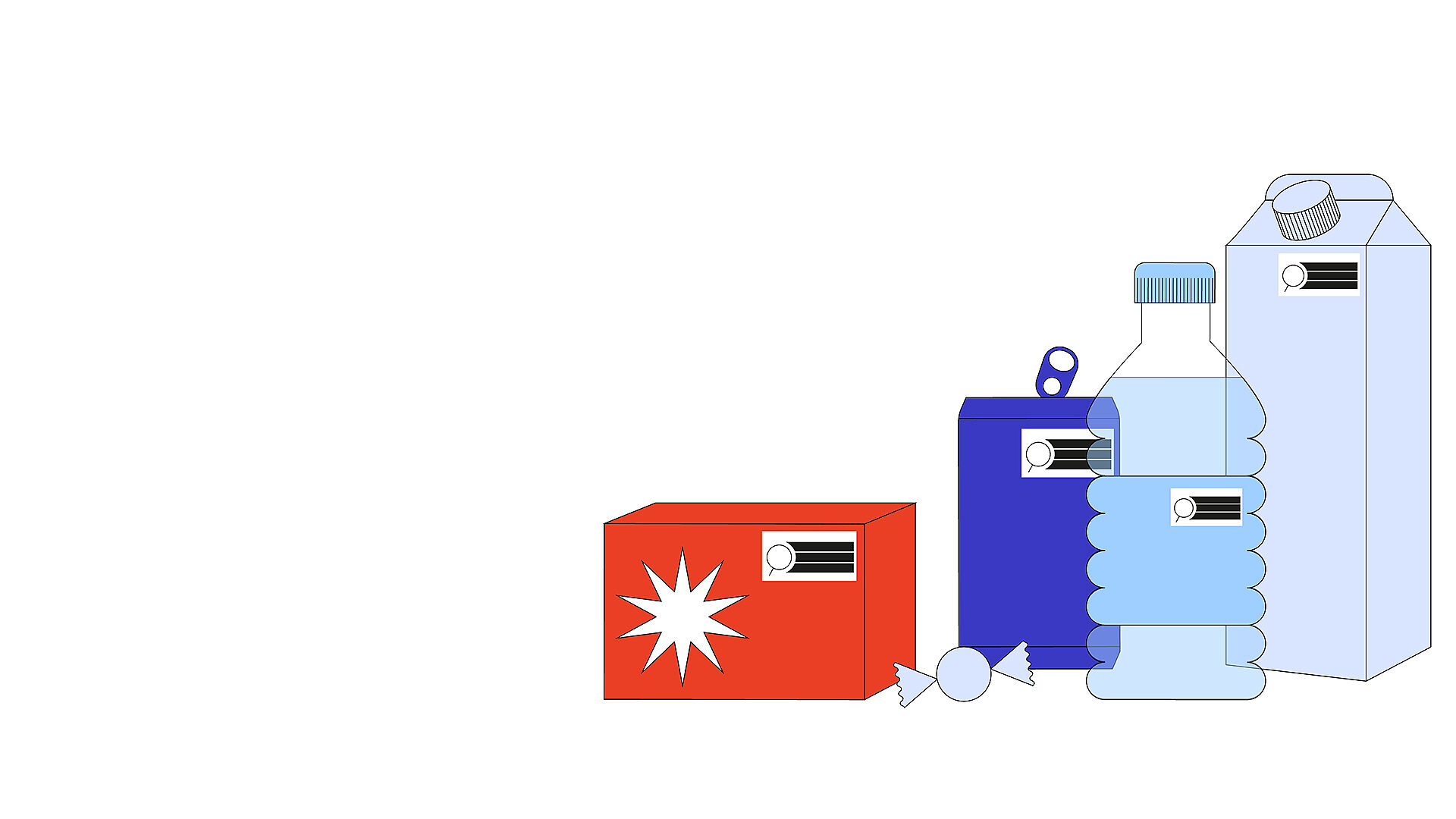
As of January 1, 2026, Health Canada will require a nutritional symbol in the form of a magnifying glass to be prominently displayed on the front of packaging for foods high in saturated fat, sugars or sodium.
Thresholds
To help you understand this new government requirement and how to comply with it while maintaining your brand image, L’actualité ALIMENTAIRE spoke with two experts.
Julie Langlois, Director of Labelling and Regulation at the Group Export, Canada’s largest association of agri-food exporters, says Health Canada’s primary goal with this initiative is to raise awareness about the health risks associated with excessive consumption of certain nutrients. These new regulations warrant food processors’ full attention and involve upstream work to assess products’ nutritional value – a step that can’t be left to the last minute.
The thresholds established by Health Canada correspond to a percentage of the daily value per reference amount or serving size, whichever is greater. Unless an exemption has been granted by the Ministry, the thresholds are divided into three product categories according to the percentage of the daily value of saturated fat, sugar or sodium:
Prepackaged foods (⩾ 15%)
Prepackaged foods with a reference amount of ⩾ 30 g or 30 ml (⩾ 10%)
Prepackaged main dishes with a reference amount of 200 g or more (⩾ 30%)
If the recommended daily value threshold for one or more of the three nutrients is reached or exceeded, the nutritional magnifying glass must be included on the packaging. Preparing for this possibility is key.

“Packaging is design at its simplest. It has a 100% utilitarian role: to inform, to convince, to build loyalty.”
Élise Cropsal
Creative Director, Branding and Design at LG2
Coexistence with a visual identity
Élise Cropsal, Creative Director of Branding and Design at LG2 explains that when the magnifying glass is required on packaging, it goes beyond just adding a symbol to an existing graphic design. The front of a product is an essential communication space for a brand’s identity. We want to avoid visual overload and get the right messages across: both those required by Health Canada and those that are part of the visual identity.
Since the nutrition symbol is meant to be seen and immediately understood by consumers, it’s subject to certain rules in terms of how it appears on packaging. It must be placed in the upper half of the label, or in the right half if the label is wider than it is tall, which can conflict with other important elements of the packaging, including the logo. Consideration must therefore be given not only to design, but also to strategy in some cases. Should information that takes up too much space be removed? Is the product still attractive? Should we think about the messages we want to convey now that the magnifying glass conveys its own message?
“The nutritional symbol can also be seen as an opportunity to review product recipes. Collaboration with the research and development team can be part of the solution.”
Group Export
Design and strategic thought process
Cropsal explains that selecting the size and orientation of the magnifying glass remains the key issue, as this choice is based on the principal display surface (PDS) and not the product’s printable surface – in this case, the principal display panel (PDP), better known as the label. Since the calculation refers to the PDS, it might be tempting to enlarge the label to leave more room for the visual identity. However, this approach has implications for eco-responsibility, a commitment that impacts both consumers’ purchasing decisions and a brand’s credibility.
This is where design needs to go beyond simply adding a symbol to the packaging. The positioning of the magnifying glass competes with the inclusion of key information, such as the brand name or flavours.
It is therefore important to think broadly about the entire surface of the packaging to redesign the elements appropriately. The information hierarchy will also need to be thought through sometimes, taking the full range of packaging into account. This is because, as Cropsal points out, a low-sugar product might not have a symbol at all, unlike the same product in its regular version. The design must, however, remain similar.

The introduction of these regulations plays an essential role in promoting public health and transparency in the food industry. It is certainly changing the way we look at packaging and display product information. That said, “the nutritional magnifying glass also provides an opportunity to create,” the experts point out. Is it time to rethink recipes and sit down with the research and development team? Is it time to rethink your visual identity and incorporate this symbol right from the start of the creative process? This change can certainly help brands stand out in a positive way.